Latest issue
The Abstraction You Didn't Ask For: When Component APIs Force Context on You
9/14/2026
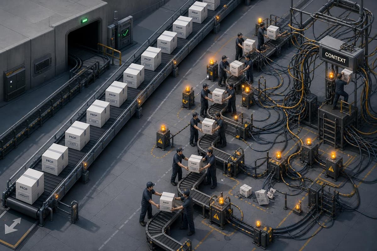
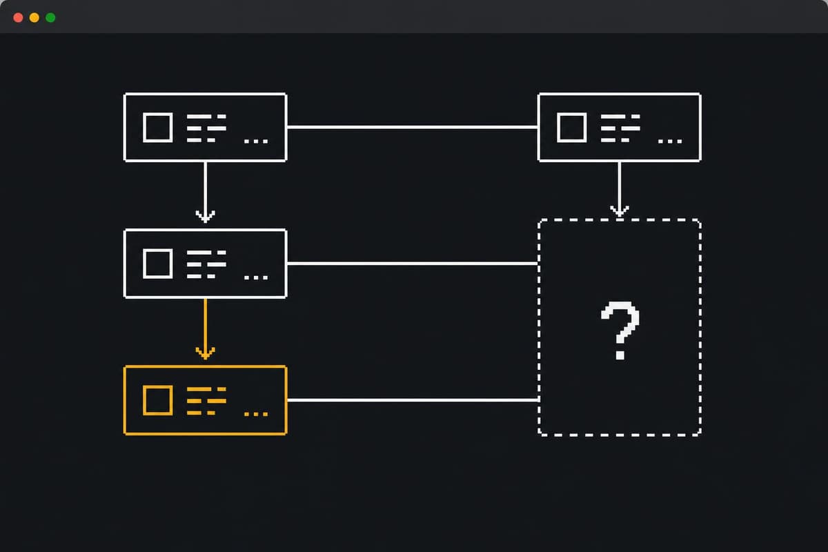
Here's a scene that plays out constantly in startup codebases. A developer needs to pass a single value — say, an active state flag — from a parent component down to a leaf. The design system's component API doesn't expose a prop for it. The docs say to use the provided context.…
Recent posts
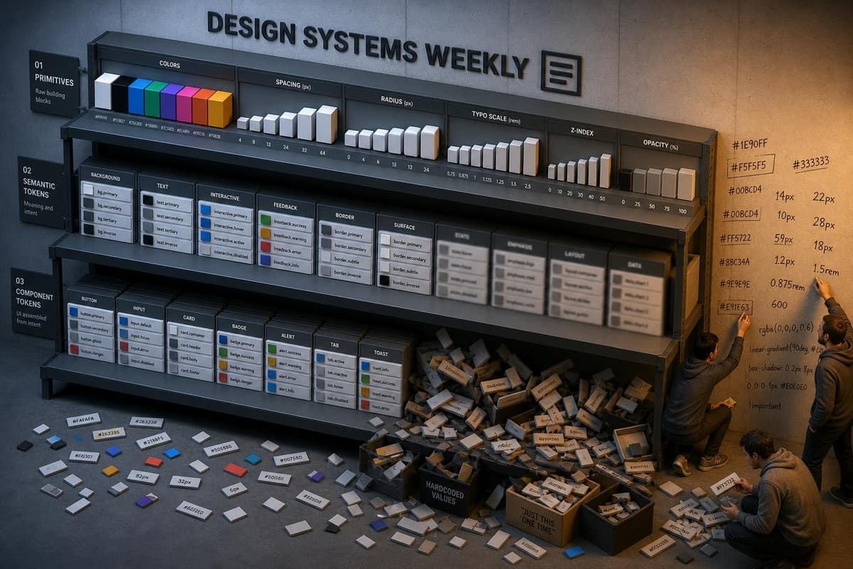
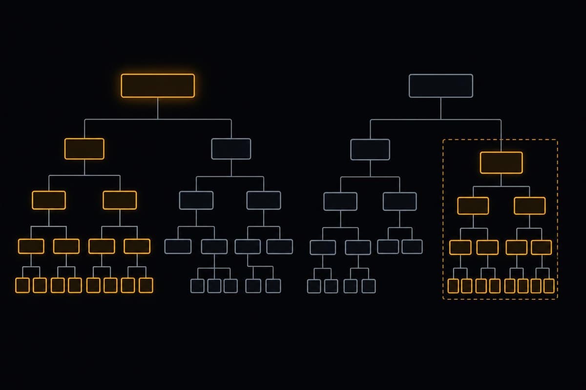
Here's the failure mode: you build a clean three-tier token system. Primitives hold raw values. Semantic tokens map intent to those primitives. Component tokens reference semantics…
Here's a scene worth sitting with. A designer needs a testimonial block for a landing page going live in 48 hours. She opens the Figma library and finds three options: Testimonial…
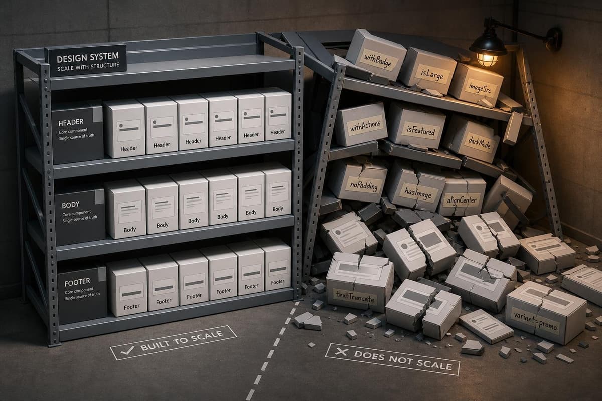
Here's the failure sequence, and you've probably lived it: you build a clean Card component. Compound pattern, properly decomposed — Card.Header, Card.Body, Card.Footer. Consumers…
Here's a scene worth sitting with: one developer opens a ticket, finds a piece of state that needs to travel four levels down the component tree, and reaches for React Context. Ano…
Three weeks ago I wrote about premature semantic layers — the failure mode where teams build elaborate alias hierarchies before they have enough product surface to justify them. To…
Here's the trap: you spend a sprint building a token naming system that reads like a sentence. color-action-primary-bg-hover. Clean. Grammatical. As one practitioner framing the ap…
Here's the failure mode nobody talks about until they're already in it: you start with a clean three-tier token architecture — reference, semantic, component — and six months later…
Here's a failure mode that shows up in almost every growing component library: a team adopts composition patterns to escape prop explosion, and six months later they've traded one…
Here's the failure mode I keep seeing: a team hits prop drilling pain, reaches for Context, and then six months later they're debugging mystery re-renders across half the component…
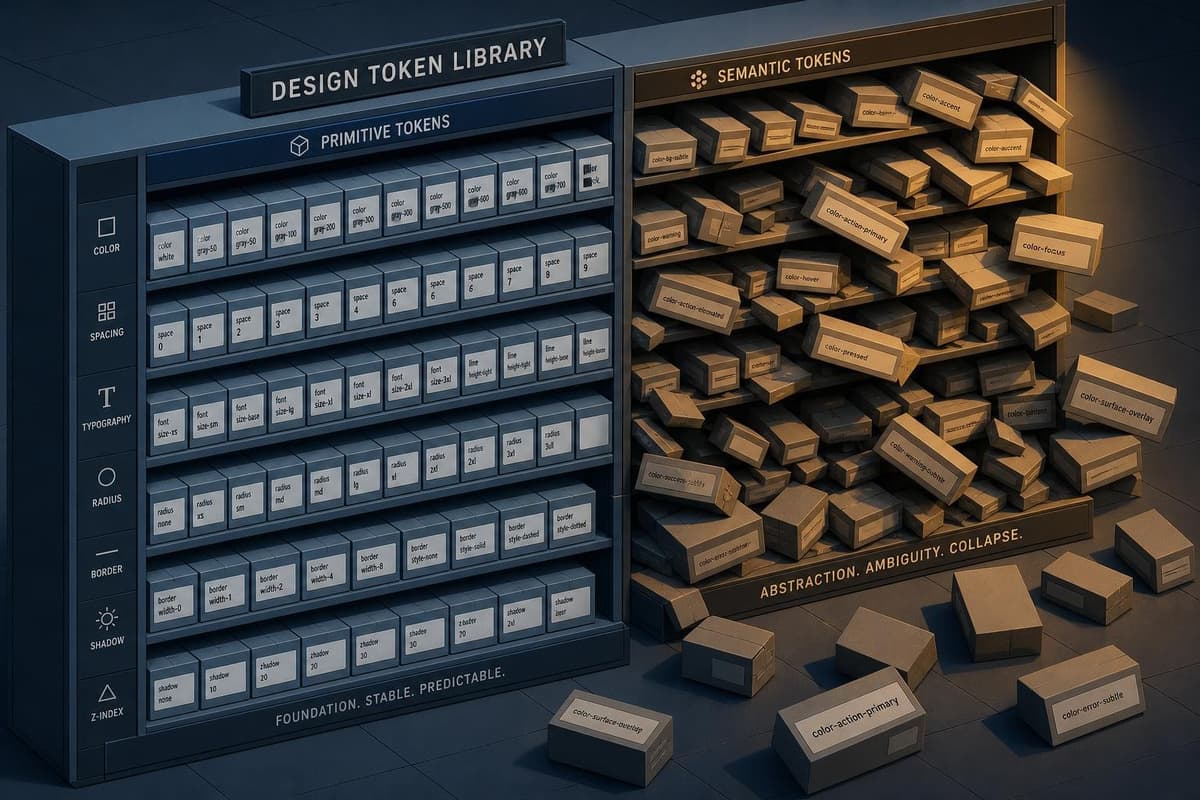
Here's the failure mode: you spend a week naming tokens correctly. color-action-primary, color-feedback-danger, color-surface-overlay. The names communicate intent. They survive a…
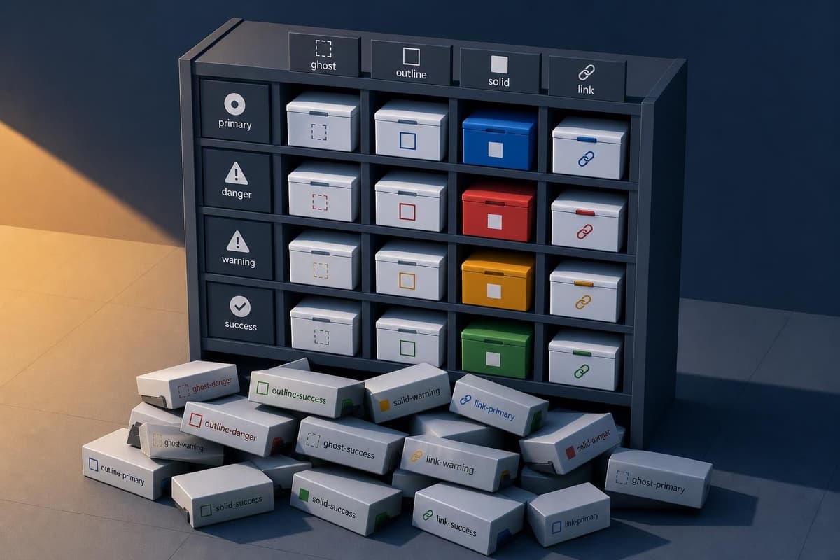
Here's a scene that should feel familiar: you open a codebase and search for Button. You find ButtonPrimary, ButtonSecondary, ButtonDanger, ButtonGhost, ButtonLink, ButtonSmall, Bu…
Here's the failure mode I keep seeing: a team spends two weeks debating whether a CardWithAvatar is a molecule or an organism. They update the Figma library, they update Storybook,…
Here's a failure mode that plays out on a predictable schedule, and I've watched it happen enough times to recognize the stages. A team adopts semantic token naming — color-surface…
Here's a pattern that ships in nearly every component library: a provider at the root, a useContext hook inside each component, and a clean API that hides all the wiring. It looks…
Here's a number that should give you pause: one Button component with four variants, six sizes, nine radius values, and a boolean flag produces north of four hundred valid combinat…
There's a reflex in startup codebases that goes like this: the team wraps a third-party component, the wrapper grows, someone complains it's "just extra indirection," and the next…
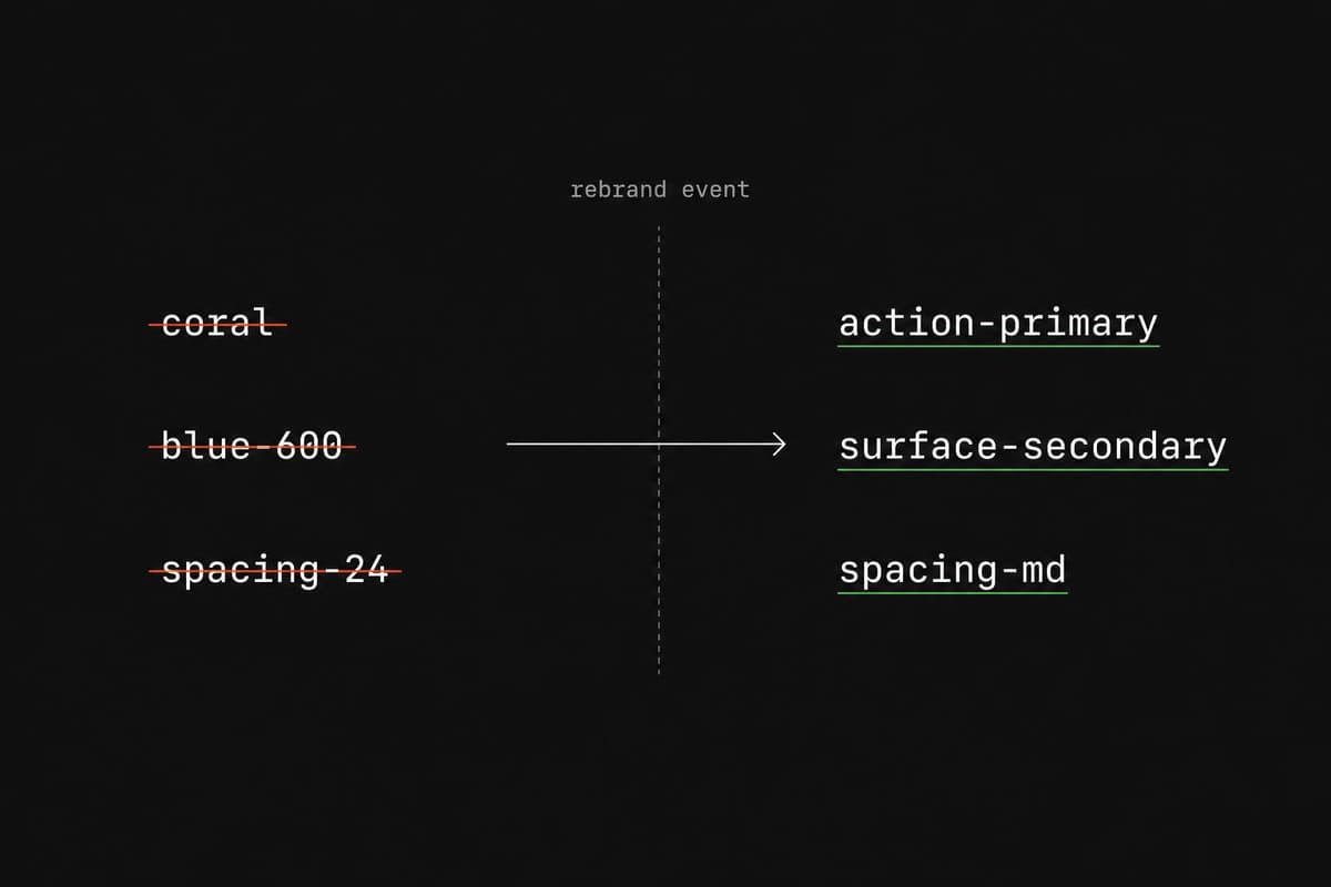
Here's a failure mode that plays out on a predictable schedule: a team names their primary action color coral because the brand is warm and the designer loves it. Eighteen months l…
There's a reflex in component library work: when you see props being passed through two or three layers, you reach for abstraction. A compound component, a context provider, a conf…
Here's a number that should bother you: 89% of design systems ship code examples, but only 37% include usage guidelines. The components exist. The props are typed. The Storybook st…