Most teams shipping with shadcn/ui believe they get accessibility for free. Radix handles the semantics, the ARIA attributes wire themselves up, keyboard navigation just works. You copy the component, add your Tailwind classes, and move on.
That belief is partially true and dangerously incomplete.
A recent WCAG 2.2 AA audit of all 48 shadcn/ui components found that 14 of them fail out of the box — not because Radix's primitives are broken, but because shadcn's default styling actively undermines what Radix provides. The most common example: the default Button component uses focus-visible:ring-ring/50, which renders the focus ring at 50% opacity. In light mode against a white background, that produces a contrast ratio of 2.4:1 — below the 3:1 threshold required by WCAG 2.2 for non-text contrast. The Radix primitive is fine. The Tailwind class on top of it is the problem.
This is the accessibility layer most teams miss. Not the ARIA semantics — those are largely handled. The gap is at the intersection of styling and behavior, where customization quietly breaks the contract Radix set up.
The asChild Trap Is Where It Usually Goes Wrong
shadcn/ui's "freedom" is real: you get the source code, you own it, you can change anything. The problem is that Radix's accessibility behavior is invisible. You see Tailwind classes. You don't see the focus management, the ARIA inheritance, the keyboard event handlers running underneath.
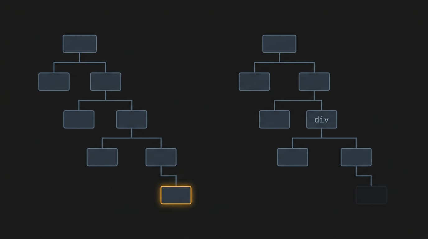
The asChild prop is where this bites hardest. As documented in a recent breakdown of shadcn/Radix customization patterns, when you use asChild, Radix clones your child element and passes its behavior and props through. Wrap a Tooltip.Trigger around an <a> tag with asChild, and the link inherits hover behavior, keyboard focus triggers, and correct ARIA attributes. That works.
Wrap a <div> around Tooltip.Trigger to add custom styling — without asChild — and you've inserted a non-interactive element between Radix and the DOM. Keyboard navigation breaks. The ARIA relationship breaks. Visually, nothing changes. In a screen reader, the tooltip is gone.
The same pattern shows up with conditional rendering. The idiomatic React approach to a dropdown is {open && <Listbox />}. Clean, readable, and wrong for an accessible combobox. If the listbox is conditionally rendered, aria-controls on the trigger references an element that doesn't exist when the dropdown is closed. The nuka-ui codebase documents this explicitly: the fix is hidden={!open} — always in the DOM, removed from the accessibility tree when not needed, aria-controls always resolves. One requirement, three implementation consequences. The simpler approach works visually. It doesn't work for screen readers.
What "Accessibility by Default" Actually Means
Here's the tradeoff worth naming clearly: Radix gives you correct behavior. shadcn gives you correct behavior with styling applied. Your customizations give you correct behavior with styling applied, minus whatever you accidentally removed.
The audit finding that 34 of 48 components pass WCAG 2.2 AA out of the box is genuinely good news — but it comes with a caveat that matters for startup teams: if you override --ring or --primary to a low-contrast color, you can break what was passing. The accessibility guarantee is conditional on not touching the tokens that encode it. Most teams touch those tokens on day one.
The deeper issue is architectural. A recent piece on design system self-knowledge frames it well: the semantic choices, the token references, the accessibility metadata — these are the intent behind a component, not just its surface. When a developer picks up a shadcn component, they bring context. They know (or can figure out) why the focus ring is there. When they're moving fast and the design spec calls for a different color, they override it without knowing what they're overriding.
This isn't a shadcn problem specifically. It's the cost of any system where accessibility is implemented as a layer rather than a constraint. The difference between the two: a layer can be removed. A constraint can't.
The Decision Heuristic
Before customizing any interactive shadcn/ui component, ask two questions:
1. Am I touching a prop that controls DOM structure or element type? Swapping tags, adding wrapper divs, using asChild incorrectly — these break ARIA relationships. If you're changing what renders, verify keyboard navigation and screen reader behavior after.
2. Am I overriding a token that encodes contrast? --ring, --primary, --muted-foreground, --border — these aren't just aesthetic. Run your overrides through a contrast checker before shipping. The button focus ring fix from the audit is one line: focus-visible:ring-ring focus-visible:ring-2 focus-visible:ring-offset-2 focus-visible:ring-offset-background. It takes thirty seconds and it's the difference between passing and failing a procurement audit.
The accessibility you get from shadcn/ui is real, but it's not unconditional. Treat it like a dependency with a contract: read the contract before you modify the code.


