

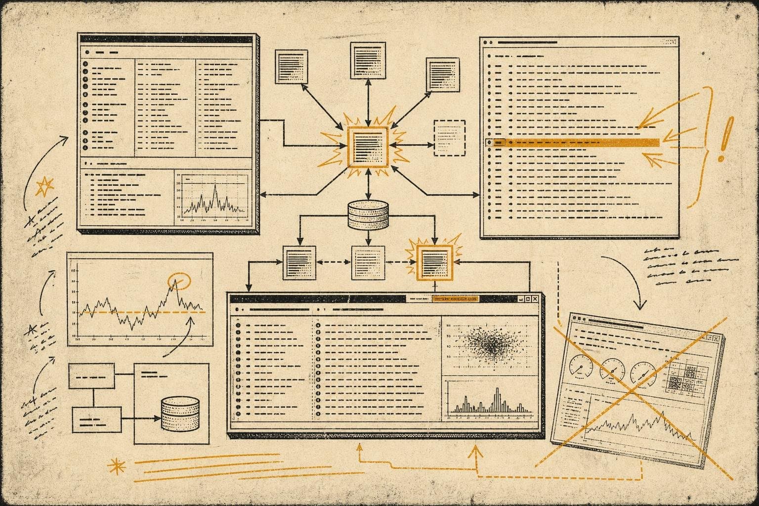

There's a particular kind of operational irony that only reveals itself at 2am: the team spent three months building a beautiful observability dashboard, and when the incident actually fires, everyone is staring at raw logs in a terminal window.
This isn't a failure of tooling. It's a failure of system design — specifically, the design of how humans interact with information under pressure. And it's worth examining honestly, because the gap between the monitoring systems teams build and the monitoring systems teams actually use during incidents is one of the most consistent patterns in production operations.
What Teams Build vs. What Teams Use
The dashboard gets built during calm periods, by people thinking carefully about what matters. It has service health at the top, error rates by endpoint, latency percentiles, dependency status. It looks authoritative. It probably took a sprint to get right.
Then an incident fires. The on-call engineer gets paged. And within about ninety seconds, they've opened four terminal tabs, are grepping through logs, and the dashboard is minimized behind everything else.
Why? Because dashboards are built for understanding a system in steady state. They're optimized for the question "how is everything doing?" Incidents require a different question: "what just changed, and where?" Those are not the same question, and they don't have the same answer interface.
Logs tell you what happened in sequence. Dashboards tell you what's happening right now. Under incident pressure, sequence usually wins — because the first thing you need to establish is a timeline, not a snapshot.
The teams that close incidents fastest tend to have invested less in beautiful dashboards and more in making their logs actually parseable under pressure: consistent structured logging, clear correlation IDs that thread a request across services, and log levels that mean something (not everything at INFO because someone was lazy).
The Cognitive Load Problem Nobody Budgets For
Here's the thing about incident response that doesn't show up in runbooks: the cognitive load of context-switching between tools is enormous when you're already stressed. Every time an engineer has to remember "which dashboard was it, what's the URL, do I need to change the time range" — that's working memory spent on navigation instead of diagnosis.
This is why the teams with the best incident response times tend to have boring, consistent tooling. Not the most powerful tooling. Not the most feature-rich. The most predictable. The engineer who's been paged at 3am knows exactly where to look because the answer is always in the same place, formatted the same way.
The operational pattern that actually works looks something like this: one canonical place for logs, one canonical place for metrics, and a runbook that tells you which one to check first for which class of problem. Not a dashboard that tries to show you everything. Not a unified observability platform that requires you to learn a query language while half-awake.
The irony is that this is the opposite of what gets sold at conferences. Vendor demos show you finding the root cause in thirty seconds with a beautiful flame graph. Production reality is usually "we grepped for the error string, found it in service B, checked when it started, and correlated that with the deploy that went out at 11pm."
The Useful Dashboard Is a Different Animal
None of this means dashboards are useless. It means they're useful for a different job than incident diagnosis.
The dashboards that actually get used during incidents share a few characteristics. They're narrow — one service, one signal, not a fleet overview. They have a time range that defaults to "last hour" not "last day." They show change prominently, not just current state — a graph that makes it visually obvious when something shifted is more useful than a number that requires you to remember what normal looks like.
And critically: they're built by the people who get paged, not by the people who manage the people who get paged. The distance between "person who builds the dashboard" and "person who uses it at 3am" is one of the most reliable predictors of whether the dashboard will actually help.
The teams I've seen handle incidents well tend to do a specific thing after every significant incident: they ask not just "what broke" but "what did we actually look at to figure that out?" Then they make that thing easier to find next time. That's how useful monitoring gets built — not from a sprint, but from accumulated incident experience feeding back into tooling decisions.
The beautiful dashboard that nobody looks at during an incident isn't a waste. It's a diagnostic signal. It's telling you that your monitoring was designed for the wrong moment.
Build for the 3am version of your team, not the 2pm version.