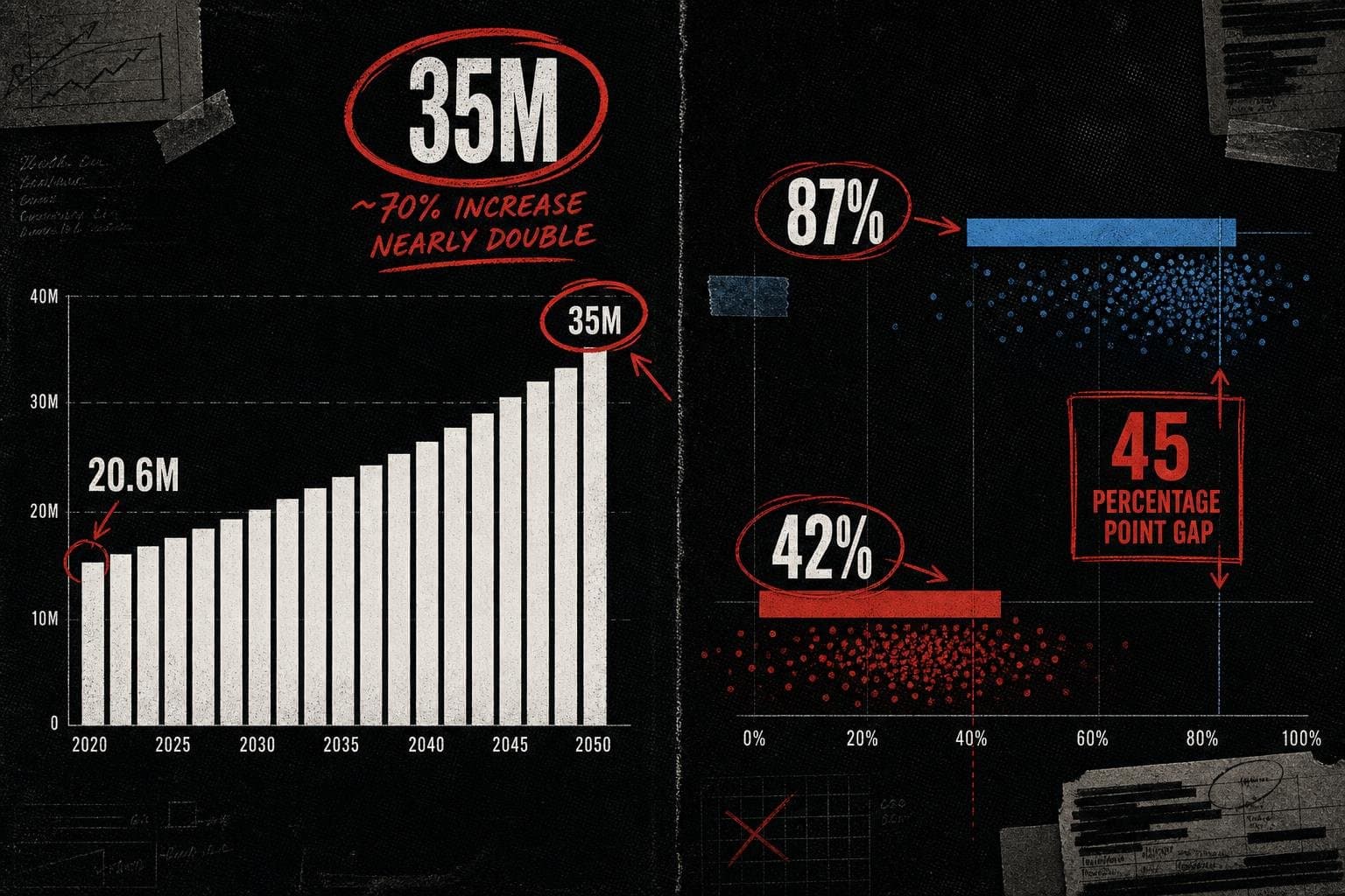

35 million new cancer cases by 2050. Nearly double today's numbers. The figure landed this week with the gravitational force of a verdict — shared across health desks, social feeds, and policy briefings as though the math were settled and the story were simple.
It isn't. And the gap between what the WHO's Global Status Report on Cancer 2026 actually says and what the headlines are implying is exactly the kind of denominator problem this publication exists to flag.
Let's work backward from the number.
"Nearly Double" Is Doing Three Jobs at Once
The WHO report, developed jointly with the International Agency for Research on Cancer (IARC), projects annual new cancer cases rising from approximately 20.6 million today to nearly 35 million by 2050. That's the headline figure. It is real, it is sourced, and it is alarming.
But "nearly double" is a compound claim. It bundles together three distinct forces — population growth, population aging, and changes in age-specific cancer risk — and presents their combined output as a single, undifferentiated trend. Most coverage strips out the decomposition entirely and hands you the sum.
Why does this matter? Because the policy response to "more people are getting cancer at higher rates" is fundamentally different from the policy response to "there will be more elderly people, and elderly people get cancer." The first is a story about carcinogens, screening failures, or behavioral risk factors. The second is, in large part, a story about demographic success — people living long enough to reach the ages where cancer becomes common.
The WHO report acknowledges this. It notes that population growth and aging are primary drivers of the projected increase. But that acknowledgment tends to disappear in the translation from technical document to headline. What remains is the number: 35 million. Urgent. Doubling. Act now.
The number may well justify urgent action. The WHO's call for investment in prevention, screening, and treatment is well-grounded. But the reason for urgency matters enormously for what kind of action makes sense — and the headline version of this statistic doesn't tell you the reason.
The Survival Gap Is the More Honest Number
Buried beneath the projection figure is a comparison that deserves far more attention than it's getting.
The WHO report states that 87% of women with breast cancer survive five years after diagnosis in high-income countries. In low-income countries, that figure is approximately 42%.
Read that again. Same disease. Same five-year window. A 45-percentage-point gap in survival, depending on where you were born.
This is not a projection. It is not a model output. It is a current, measured disparity — and it is the most actionable number in the entire report. If you want to understand where cancer deaths are concentrated and where intervention has the highest marginal return, this is your denominator.
The 35 million projection tells you something will happen in the future. The 87%-vs-42% survival gap tells you something is happening right now, and tells you exactly where the leverage is. Yet the projection dominates coverage because big round numbers travel better than percentage-point gaps.
The report also notes that fewer than one in three countries currently include cancer care in their universal health coverage packages. That's a structural fact about present-day health systems, not a forecast. It explains a significant portion of the survival gap. And it received a fraction of the attention that the 2050 headline attracted.
What "Projected to Nearly Double" Actually Requires You to Believe
Projections are models. Models have assumptions. The assumptions are where the work is.
The WHO/IARC projection to 2050 spans 24 years from today. Over that window, it must make assumptions about global population size, age structure, migration patterns, economic development trajectories, tobacco use trends, obesity rates, screening program expansion, treatment access changes, and the pace of medical innovation. Each of those assumptions carries uncertainty. Compounded across 24 years and every country on earth, the uncertainty bands around "35 million" are substantial.
The WHO report does not, in the excerpts available, publish confidence intervals around the 35 million figure. That's not unusual for this type of global burden projection — the IARC's modeling methodology is well-established — but it means that every outlet reporting "35 million" as a precise forecast is presenting a point estimate as though it were a measured fact. It is a central estimate from a model. The actual 2050 figure could be meaningfully higher or lower depending on which assumptions prove correct.
This is not a reason to dismiss the projection. It is a reason to hold it correctly. "Cancer burden is on track to increase substantially by mid-century, driven primarily by demographic change, with the scale depending on how aggressively prevention and treatment gaps are closed" is a more accurate rendering of what the data say. It is also, admittedly, a worse headline.
The WHO is not being dishonest by publishing a point estimate. Communicating uncertainty in public health messaging is genuinely hard — confidence intervals cause eyes to glaze over, and "somewhere between 28 and 42 million" does not mobilize the same response as "35 million." But the media's job, and this publication's specific job, is to restore the uncertainty that the headline strips out.
The Equity Frame Is the Right Frame — and It's Being Underused
Here is what the WHO report is actually arguing, if you read past the projection: the cancer crisis is, to a significant degree, an equity crisis.
The 87%-vs-42% breast cancer survival gap is one data point in a broader pattern. The report documents persistent and widening inequities in access to prevention, diagnosis, treatment, and supportive care. It notes that cancer claims more than 26,000 lives every day globally — a figure that, when annualized, works out to roughly 9.5 million deaths per year, consistent with the report's stated annual death toll of close to 10 million.
Those deaths are not distributed evenly. They concentrate in places where screening is unavailable, where treatment is unaffordable, and where cancer care sits outside universal health coverage packages. The projected rise to 35 million annual cases by 2050 will also not be distributed evenly — the burden will fall disproportionately on low- and middle-income countries, which are simultaneously experiencing the fastest population growth and the weakest health infrastructure.
This is the story that the 35 million headline obscures. The aggregate projection sounds like a global problem requiring a global solution of roughly uniform urgency. The equity data reveals a problem that is geographically concentrated, mechanistically understood, and — in principle — addressable through targeted investment in specific health system gaps.
"Cancer cases will nearly double by 2050" is a call to general alarm. "42% five-year survival for breast cancer in low-income countries versus 87% in high-income countries, right now, today" is a call to specific action. The second framing is harder to sensationalize and easier to act on.
The Projection Isn't Wrong. The Framing Is.
To be precise about what this critique is and isn't: the WHO report appears to be serious, well-sourced work from credible institutions with established methodology. The 35 million projection is not fabricated or cherry-picked in the way that some viral statistics are. The survival gap data is exactly the kind of measured, current disparity that should anchor public health coverage.
The problem is the translation layer — the gap between what a technical report contains and what the headline version communicates.
That translation layer consistently makes the same errors. It leads with the largest, most dramatic number. It strips out the decomposition of causes. It presents point estimates as settled facts. It buries the current, actionable data beneath the future projection. And it loses the equity frame — the part that tells you not just that something bad is happening, but where it's happening and why.
These are not random errors. They follow a predictable pattern: whatever is biggest, most distant, and most alarming travels furthest. The 2050 projection is bigger than the current death toll, more distant than the current survival gap, and more alarming than the structural fact about universal health coverage. So it wins the headline.
The forensic question to ask of any projection is: what would have to be true for this number to be right, and what would have to change for it to be wrong? For the 35 million figure, the answer to the second question is: aggressive expansion of prevention programs, tobacco control, vaccination (HPV vaccines alone have substantial cancer prevention potential), and treatment access in low-income countries. The WHO report says exactly this. That's the story — not the number itself, but the conditions under which the number gets smaller.
Watch for the IARC's underlying methodology documentation, which should accompany the full report release and will show the demographic decomposition in detail. That's where you'll find out how much of the 35 million is aging, how much is population growth, and how much is genuine change in age-specific incidence rates. Until that decomposition is public and widely reported, the headline number is telling you less than it appears to.
The 26,000 daily deaths are happening now. The survival gap is measurable now. Those are the numbers that should be leading.