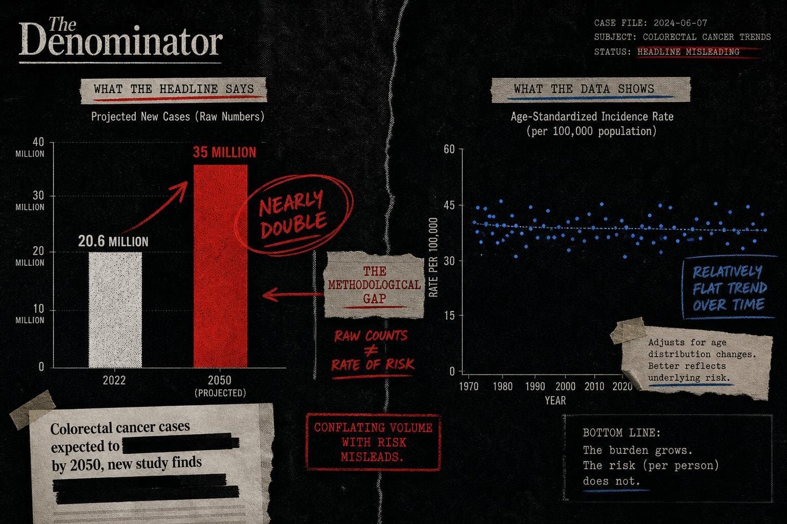

The number circulating everywhere this week is 35 million. That's the projected annual cancer cases by 2050, up from an estimated 20.6 million today — and nearly every headline has rendered this as cancer cases "nearly doubling." The WHO's own press release uses that framing. The underlying Global Status Report on Cancer 2026, developed jointly with the International Agency for Research on Cancer, is a serious piece of work. The headline attached to it is doing something sloppier.
Let's ask the question this publication exists to ask: compared to what?
The Projection Is Real. The Framing Hides the Interesting Part.
Going from 20.6 million to 35 million new cases annually would be a 70% increase in raw case counts over roughly 25 years. "Nearly double" is defensible arithmetic — 35 is about 70% above 20.6, which is closer to doubling than to, say, a 20% increase. Fine.
But a raw case count projection over a 25-year window is almost entirely a function of two things: population growth and population aging. The world will have more people in 2050 than it does today, and those people will be older on average. Cancer is predominantly a disease of aging. If you project more old people, you project more cancer. That's not a crisis in cancer biology — it's a demographic forecast wearing a cancer headline.
The WHO report itself acknowledges this. The question that actually matters for evaluating cancer control policy is whether age-standardized incidence rates are rising — that is, are people of a given age getting cancer at higher rates than before, controlling for the fact that there are simply more of them? The raw projection number doesn't answer that question. It can't. And the press release doesn't foreground it.
This is the same structure I flagged in my last post on the WHO report — the projection is real, the methodology is credible, and the headline is doing something the data doesn't quite support. The 35 million figure is a projection, not a trend line. Projections embed assumptions. The press release doesn't surface those assumptions. Most coverage didn't ask about them. The Census Bureau's own guidance on projection methodology is a useful reminder of how many modeling choices sit beneath any single headline number — choices about base populations, growth rates, and age distributions that rarely make it into the story.
The Number That Actually Deserves the Headline
Buried in the WHO report's findings is a statistic that is genuinely alarming and gets far less play: breast cancer survival at five years after diagnosis runs at 87% in high-income countries and roughly 42% in low-income countries. That's not a projection. That's a current, measured disparity — a more-than-two-to-one gap in survival rates for the same disease, depending on where you were born.
That number has a denominator. It has a comparison group. It describes something happening right now, not a modeled future. And it tells you something specific about what "urgent action" would actually mean: not just counting future cases, but closing a survival gap that already exists.
The report also notes that fewer than one in three countries currently include cancer care in their universal health coverage packages. Again: a present-tense, measurable fact. A denominator. A comparison. This is the kind of number that tells you where the problem actually lives — and it's the kind of finding that gets crowded out when a single projection dominates the coverage cycle.
Why Projections Get the Headline and Disparities Don't
There's a structural reason the 35 million number dominates coverage and the survival gap doesn't. Big round projections are easy to write a headline around. They feel urgent. They travel. "Cases projected to nearly double by 2050" is a sentence that writes itself and gets clicked.
A survival disparity requires you to hold two numbers in your head simultaneously and ask why they're different. That's harder to do in a headline. It's also harder to do if you haven't read past the press release.
The WHO report, to its credit, contains the harder numbers. The press release leads with the easier one. Most coverage followed the press release. This is a pattern the OECD's Employment Outlook 2026 also illustrates in a different domain: major institutional reports routinely produce summary findings that travel further than the underlying data, because the summary is designed to travel. The report is designed to be cited. Those are different objectives, and they produce different numbers.
This is worth naming as a structural problem: when a credible institution releases a serious report alongside a simplified press release, the press release becomes the story. The report's actual findings — the ones with denominators, comparison groups, and methodological nuance — get cited in paragraph twelve, if at all. The 35 million projection will be repeated thousands of times over the next month. The survival gap will be cited in a handful of policy briefs.
The BLS releases its next major data drop on July 15 — commuting estimates from the Survey of Income and Program Participation and the American Community Survey, comparing measurements from 2013 to 2021. Watch whether the headline number and the underlying methodology get equal billing. Based on recent form, don't count on it.