


The Headline Number
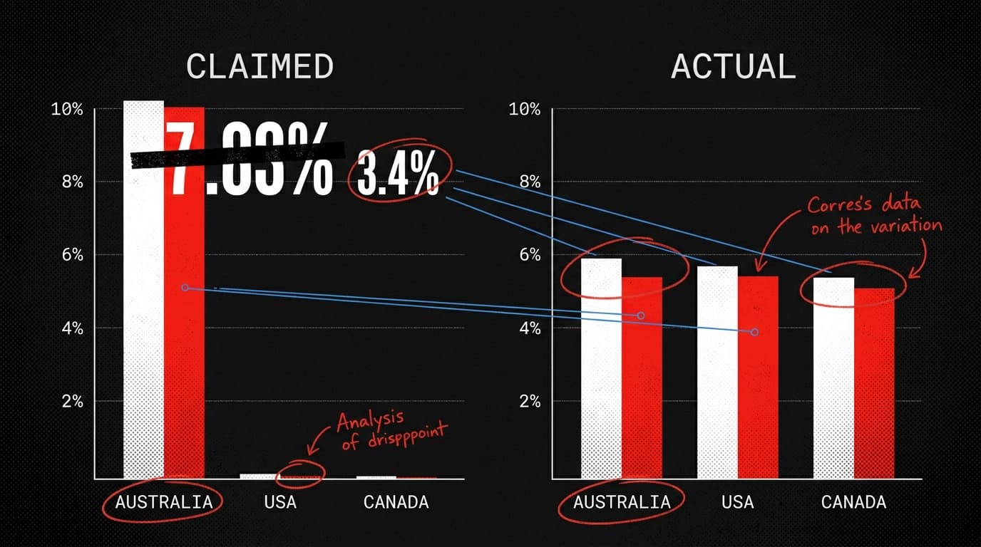
"Petrol prices have risen 39% in Australia, but only 16.6% in the US and 10.6% in Canada since the start of the war."
— circulating on Facebook and Instagram since late March 2026
The Audit
The graphic looked damning. Australia's petrol prices surging nearly 40 percent while Canada barely cracked 11 percent? That's not a gap — that's a chasm. It spread across Facebook and Instagram, attached to exactly the kind of outrage you'd expect: government failure, price gouging, Australia getting fleeced while the rest of the world shrugged.
The numbers were wrong. Not slightly off. Wrong by a factor of roughly four.
AAP Factcheck traced the figures back to primary data sources — the Australian Institute of Petroleum, the US Energy Information Administration, and Canada's natural resources agency — and found a very different picture. Australian petrol prices did rise sharply: about 40 percent between March 1 and March 29. That part held up. But the US figure wasn't 16.6 percent. By March 23, US prices had risen approximately 30 percent compared to early March levels. By April 6, they were up 35 percent. Canada's prices rose roughly 29 percent by March 23, reaching about 35 percent above pre-war levels by April 7.
So the actual gap between Australia and its closest comparators was somewhere between 9 and 11 percentage points. The graphic implied a gap of 22 to 28 percentage points. The story it told — Australia uniquely hammered while North America barely felt it — was arithmetically false.
Verdict: Misleading. The Australian increase was real. The comparison was fabricated.
The Denominator Problem, Petrol Edition
This is a classic base-rate manipulation, and it works because most readers don't go look up the denominator. The graphic gave you a numerator (Australia's 39 percent) and a fake denominator (Canada's 10.6 percent). The ratio felt meaningful because ratios always feel meaningful. Four times as much! The math practically does the outrage for you.
What the graphic actually required was a consistent measurement window and a consistent data source for every country listed. It had neither. The Australian figure appears to have been measured from a different start date than the North American figures — and the North American figures were simply wrong, likely drawn from an earlier snapshot before prices had fully adjusted to the conflict.
The European figures in the graphic were also off, though by smaller margins — a few percentage points in either direction rather than a factor of four. Germany's actual rise was 2.1 percentage points lower than claimed; Spain's was 3.1 points higher; France's was 4.3 points lower. Those errors are noise. The North American errors were the story.
Why This Pattern Keeps Working
There's a specific reason fuel price comparisons are especially vulnerable to this kind of distortion: prices move fast during supply shocks, which means the measurement date matters enormously. A graphic assembled on March 22 using data from different collection dates for different countries will produce nonsense comparisons even if the person making it isn't trying to deceive anyone. The graphic appears to have first circulated on March 22 — when Australia's prices were about 31.5 percent above pre-war levels, not the 39 percent claimed — suggesting the figures were already stale or misread at the moment of posting.
That's the charitable interpretation. The less charitable one is that someone found a data point for Australia that looked alarming, found old or misread data for the US and Canada, and published the comparison without checking whether the windows matched. Either way, the result is the same: a chart that looks like evidence and isn't.
The forensic accountant's rule applies here: before you share a percentage, ask what it's a percentage of, and ask when. If the graphic doesn't tell you the base date and the data source for every country it lists, it's not a comparison. It's a vibe with a number attached.
By the Numbers
3 — The number of companies the FTC settled lawsuits against for falsely claiming their products were "Made in the USA," including a seller of American flags sourced from China. The label is a claim. Treat it like one.
No evidence — The finding of a 2020 American Statistical Association report on mail-in voting and fraud risk, per the New York Times. "No evidence of increased risk" is not the same as "proven safe" — but it's also not the same as the claims circulating about it.
More than politicians, less than expected — A new study in Scientific Reports found that correcting a doctor's misinformation damaged their credibility more than correcting a politician's — but belief in the misinformation dropped equivalently for both. High-credibility sources have more to lose from being wrong. That's not a reason to trust politicians more. It's a reason to hold doctors to their standard.