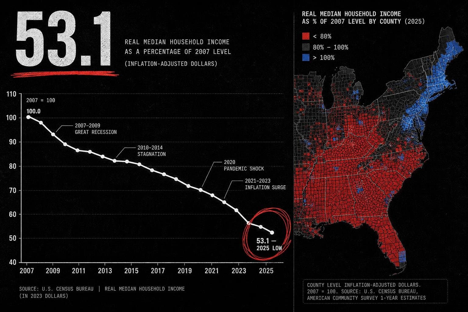

A single national number dropped quietly into the data stream last week, and most outlets either missed it or buried it in a paragraph about immigration. The U.S. general fertility rate — births per 1,000 females ages 15 to 44 — fell to 53.1 in 2025, the lowest level in a data series that runs back to 1909. That's not a rounding error. That's a 117-year floor.
The number circulating in coverage is accurate. The framing around it usually isn't.
The National Average Is Doing Real Work to Obscure Real Variation
Here's the thing about a national fertility rate: it's a weighted average of 2,703 county-level realities, and those realities are not converging. They're diverging.
The Census Bureau's county-level analysis — which combined population estimates data with birth data released in March — shows the South posting a GFR of 55.8 and the Midwest at 54.7, while the Northeast came in at 49.9. That's a gap of nearly six births per 1,000 women of reproductive age between the highest and lowest regions. Presented as a national average, that variation disappears entirely.
More importantly: the counties with the most births are often not the counties with the highest fertility rates. This is the denominator problem in its purest form. A dense urban county can produce enormous raw birth counts while its fertility rate sits below 45, because the denominator — women ages 15 to 44 — is also enormous. A rural county with a fraction of the births can have a GFR above 80 for the same reason. When media coverage focuses on where babies are being born rather than the rate at which women are having them, it's comparing numerators while ignoring denominators. That's not analysis. That's a count.
"Lowest Since 1909" Needs a Time Window, Not Just a Baseline
The 1909 anchor is doing a lot of rhetorical work in coverage of this number, and it deserves scrutiny.
The Census Bureau's own data shows the GFR was 69.5 in 2007 — the year the decline began — and has dropped nearly every year since. That's an 18-year trend, not a sudden cliff. The 2025 figure of 53.1 is the continuation of a slope, not a break from one.
The 1909 comparison is technically accurate and contextually misleading in the same breath. In 1909, the U.S. had no reliable contraception, a radically different age structure, different marriage patterns, and a substantially different economy. Saying fertility is "the lowest since 1909" tells you something about the magnitude of the decline. It tells you almost nothing about why it's happening or whether it will continue.
The more useful comparison is one the Census Bureau notes in its methodology: in 2007, when the GFR was near 70, the total fertility rate was approximately 2.1 births per woman — roughly replacement level. In 2024, the TFR was 1.6. That's the gap that matters for long-run population dynamics, and it's been opening for nearly two decades. For context on what sustained below-replacement fertility does to labor markets over time, the BLS's May 2026 employment data is quietly relevant: the labor force participation rate held at 61.8 percent in May, a figure that demographers have long tied, in part, to the aging of cohorts born during earlier, higher-fertility decades.
The "Births Exceeded Deaths" Footnote Is Doing Heavy Lifting
Here's the line that should have been the headline in most coverage, and wasn't: despite a GFR at a 116-year low, every U.S. region still had more births than deaths between 2024 and 2025.
The Census Bureau explains why: low fertility rates take time to alter the population age structure. The U.S. still has a large cohort of women in their reproductive years — the demographic echo of higher fertility decades — so even a low rate produces substantial absolute birth counts. The "population collapse" framing that often accompanies fertility coverage is, at minimum, premature. The math doesn't support it yet.
This kind of gap between a real trend and an overstated conclusion shows up across policy domains. ProPublica's recent investigation into Colorado River water rights, for instance, documents how a 118-year-old legal obligation to tribal communities has been consistently reframed as a current crisis rather than a slow-moving structural failure — the same rhetorical move that turns an 18-year fertility decline into an overnight emergency. The mechanism is identical: strip the time window, drop the denominator, and the trend looks like a shock.
What the fertility math does support is a trajectory. If the GFR continues declining — and it has declined nearly every year since 2007 — the age structure will eventually shift, and the births-exceed-deaths cushion will compress. But "eventually" is doing serious work in that sentence. Demographers have been modeling this for years, and the timeline is measured in decades, not election cycles.
The honest version of this story is: the U.S. fertility rate is at a historic low, the decline has been steady for 18 years, regional variation is substantial and mostly invisible in national coverage, and the population-level consequences are real but slow-moving. That's a less alarming story than "lowest since 1909." It's also the accurate one.
The number is real. The denominator — what it's actually measuring, over what time window, compared to what baseline — is where the story lives.