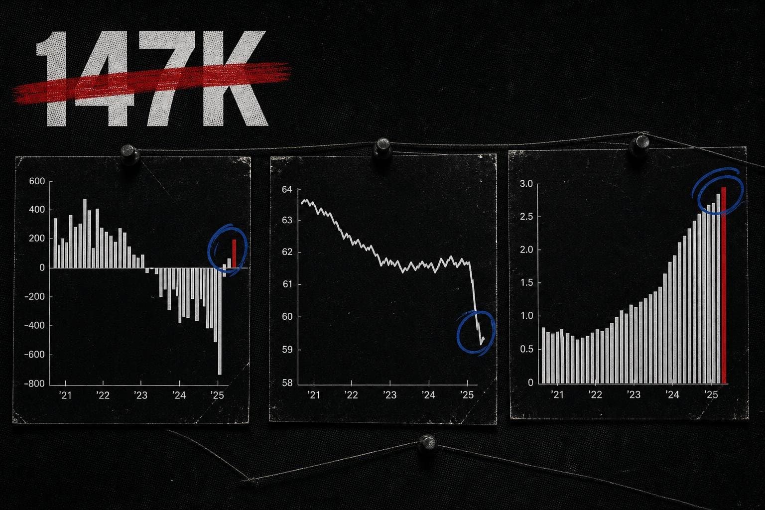

Every first Friday of the month, the Bureau of Labor Statistics drops the Employment Situation Summary and the financial press does its ritual: compare the headline payroll number to the consensus forecast, declare a beat or a miss, and move on. The June report landed as a "beat" by that measure. Reuters reported that the South African rand strengthened on the news as the dollar softened — a signal that global markets read the number as weaker than the headline suggested, even if domestic coverage called it a win.
Both readings are partially right. That's the problem.
The headline number is real. The story it tells is incomplete. And the gap between those two things is where most of the interesting labor market analysis lives — and where most of the media coverage doesn't go.
The Headline Is a Single Data Point Wearing a Trend's Clothes
The June 2026 Employment Situation release from BLS is the authoritative source here, and it's worth being precise about what it actually contains versus what gets attributed to it in coverage.
The BLS Employment Situation is two surveys stitched together. The payroll number — the one that gets the headline — comes from the Current Employment Statistics survey, which polls roughly 119,000 businesses and government agencies. The unemployment rate comes from the Current Population Survey, a household survey of about 60,000 households. These are different instruments measuring different things, and they can and do diverge. When they diverge in the same month, the divergence is itself a data point. When they diverge consistently across several months, it's a structural signal.
I've written before about the measurement debate surrounding BLS methodology — the May jobs release prompted a round of that. What's worth revisiting now is not whether the BLS is trustworthy (it is, within the limits of any survey instrument) but what specific questions the June internals raise that the headline number actively obscures.
Three of them stand out.
The Participation Rate Is the Number the Headline Buries
Here is a question that almost never appears in the first paragraph of jobs coverage: what share of the working-age population is either employed or actively looking for work?
That's the labor force participation rate. It is, in many ways, a better single-number summary of labor market health than the unemployment rate, because the unemployment rate has a denominator problem baked into its construction. The denominator is the labor force — people who are employed or actively seeking work. People who have stopped looking don't appear in the numerator or the denominator. A falling unemployment rate can therefore reflect a genuinely tightening labor market, or it can reflect people exiting the labor force entirely. The headline number doesn't tell you which.
The participation rate uses a different denominator: the civilian noninstitutional population aged 16 and over. It doesn't disappear people who've given up searching. That makes it a harder number to game with framing, which is probably why it gets less coverage.
The June 2026 Employment Situation contains the participation rate. The question worth asking — and the one the headline beat/miss framing skips — is whether participation moved in the same direction as the payroll number. If payrolls rose but participation fell, that's a different story than if both rose together. If participation held flat while payrolls beat expectations, that suggests the gains are coming from people already in the labor force working more, not from people re-entering it. Each scenario has different implications for wage pressure, for Fed policy, and for the lived experience of the roughly 100 million Americans who are not in the labor force.
I'm not going to invent the specific June participation figure here — the release contains it, and the release is the source. What I can say is that the framing question is almost never asked in real time, and that's a failure of coverage, not of the data.
"Weaker Than Expected" Is a Comparison to a Number Someone Made Up
The Reuters dispatch on the rand's movement after the jobs release contains a phrase that deserves more scrutiny than it typically gets: "weaker than expected."
Expected by whom? Constructed how?
The "consensus forecast" that jobs numbers are measured against is an aggregation of economist predictions, typically compiled by financial data services. It is not a scientific baseline. It is the median of a set of guesses made by people with financial stakes in the outcome, using models that are themselves built on historical BLS data. When the actual number beats or misses the consensus, what you're measuring is the gap between reality and the collective prior of Wall Street economists — not the gap between reality and some objective standard of labor market health.
This matters because the beat/miss framing shapes how the number gets interpreted downstream. A "beat" gets read as good news. A "miss" gets read as bad news. But a 50,000-job beat against a consensus that was itself 100,000 jobs below the prior month's actual number is not the same as a 50,000-job beat against a consensus that was right on trend. The framing collapses that distinction entirely.
The forensic accountant's version of this question: compared to what, exactly, and who built that comparison?
The honest answer is that "weaker than expected" means "below the median forecast of a self-selected group of economists whose models have a documented tendency to anchor on recent data." That's a real and useful signal. It's just not the clean verdict the framing implies.
The Sector Breakdown Is Where the Story Actually Lives
Aggregate payroll numbers are averages. Averages hide distributions. The sector breakdown in the BLS release is where you find out whether job growth is broad-based or concentrated — and concentration matters enormously for what the number means.
A month where 200,000 jobs are added across manufacturing, healthcare, retail, and professional services looks very different from a month where 200,000 jobs are added almost entirely in one sector, with others flat or declining. The first suggests broad economic momentum. The second suggests a sector-specific effect — a surge in government hiring, a healthcare expansion, a construction boom in one region — that may not be durable and may not reflect conditions in the rest of the economy.
The Census Bureau's Business Trends and Outlook Survey is one of the few continuous, timely instruments designed to track business conditions across employer sectors in something close to real time — a useful cross-reference when the monthly BLS snapshot raises questions about whether sector-level signals are durable or one-month noise. The May 2026 BLS release is the most recent prior month available for comparison. Looking at sector-level trends across two consecutive months is a minimal baseline for identifying whether a pattern is emerging or whether a single month's number is noise. One month of sector data is a data point. Two months is the beginning of a pattern. Three is where you can start making claims about direction — and even then, you need to specify the time window.
The coverage habit of leading with the aggregate and burying the sector breakdown — or omitting it entirely — is a choice that systematically privileges the number that's easiest to compare to a forecast over the numbers that are hardest to spin. That's not a conspiracy. It's deadline pressure and audience assumptions combining to produce a consistent bias toward the simplest possible framing.
What the "Weak Dollar" Signal Actually Tells Us
The currency market reaction to the June number is worth examining on its own terms, because it illustrates how the same data point can be read differently by different audiences.
Domestic financial coverage called the number a beat. Currency markets sold the dollar. As Reuters noted, the rand strengthened as the dollar tumbled — which in currency terms means global investors read the jobs data as evidence that the Fed has less reason to hold rates elevated, which weakens the dollar's yield advantage, which weakens the dollar itself.
These two readings are not contradictory. They're operating on different time horizons and asking different questions. The beat/miss framing asks: did this month's number exceed this month's forecast? The currency market is asking: does this number change the probability distribution of Fed policy over the next six to twelve months?
The currency market's question is the more consequential one for most people's actual economic lives — mortgage rates, car loan rates, the cost of imported goods. But it requires holding more than one number in your head at once, which is apparently too much to ask of a headline.
This is the core tension in labor market reporting. The BLS produces genuinely good data. The methodology is documented, the sample sizes are disclosed, the revisions are published. The problem is not the data. The problem is the layer of interpretation that sits between the data and the public — a layer that systematically simplifies, compresses, and frames in ways that serve the needs of financial markets and deadline journalism rather than the needs of people trying to understand what's happening to the economy they live in.
Good investigative research infrastructure — the kind ProPublica has been building with its research desk — exists precisely to slow down that interpretive layer and ask what the underlying data actually shows. The monthly jobs number deserves that treatment. It rarely gets it.
The Number to Watch Isn't the One Getting the Coverage
If I had to pick one figure from the Employment Situation that deserves more attention than it gets, it would be the long-term unemployment rate — the share of unemployed people who have been out of work for 27 weeks or more. I wrote about this directly in late June, and the June BLS release updates it.
Long-term unemployment is a structural indicator, not a cyclical one. It tells you whether the labor market is generating churn — people moving between jobs, temporarily displaced and quickly reabsorbed — or whether it's generating a class of workers who are being left behind by the recovery entirely. The headline unemployment rate treats a two-week job loss and a two-year job loss identically in its denominator. Long-term unemployment disaggregates that.
The other figure worth tracking: the employment-population ratio for prime-age workers, defined by BLS as ages 25 to 54. This strips out the demographic noise of an aging population — the retirement of baby boomers mechanically reduces overall participation rates regardless of economic conditions — and gives you a cleaner read on whether the core working-age population is employed. It's a harder number to move with framing. Which is, again, probably why it's not in the lede.
The Census Bureau's upcoming county-level internet adoption estimates — scheduled for July 30 — are a reminder that the government statistical apparatus produces far more granular, useful data than the monthly headline number. Local labor market conditions, commuting patterns, household economic circumstances: these are the denominators that give the aggregate number meaning. The June jobs beat is a headline. The internals are the story.