

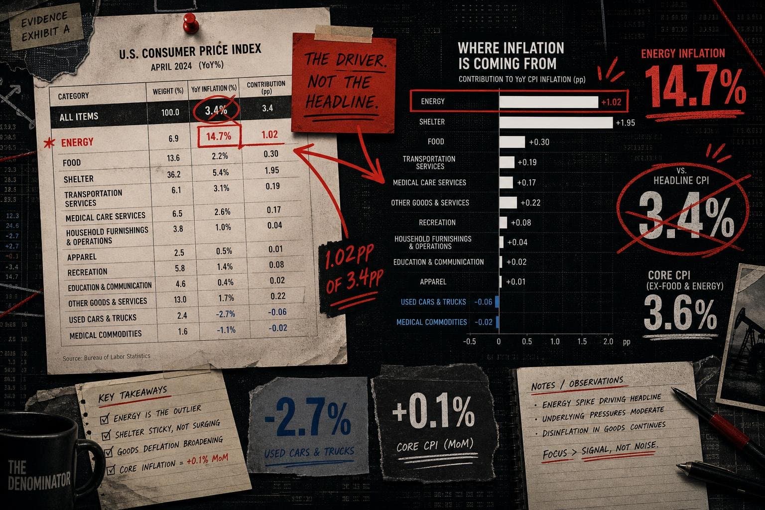

The July CPI release from BLS landed this morning with a headline number: all-items inflation up 3.4% over the 12 months ended July 2026. That's the number that will appear in every news alert. It's also the number that hides the most interesting story in the table.
Here's what the table actually says, and what each line is actually measuring.
1. The Headline Is an Average. Averages Conceal Distributions.
All items, 12-month change: +3.4%
This is CPI-U — the Consumer Price Index for All Urban Consumers, measured against a 1982–84 baseline of 100. It covers urban consumers, which the BLS defines as roughly 93% of the U.S. population. The other 7% (rural households) are not in this index.
The 3.4% is a weighted average across every expenditure category. Before you cite it, ask: weighted by what? By each category's "relative importance" — its share of the average urban consumer's spending basket as of June 2026. If your spending doesn't match that basket, your personal inflation rate differs from 3.4%. The OECD's Q1 2026 economic well-being release flags exactly this distributional problem across member economies: aggregate price indices systematically underweight the spending patterns of lower-income households, for whom food and energy represent a larger share of the basket.
2. Energy Is the Outlier That's Pulling the Headline Up — and Down Simultaneously
Energy, 12-month change: +14.7%
Energy, June-to-July monthly change: −1.5%
This is the number that deserves the headline. Energy is up 14.7% year-over-year — per the BLS release — but fell 1.5% in July alone. Gasoline specifically is up 24.6% over 12 months but dropped 2.9% in July.
What this means: the 12-month number is being dragged upward by the March spike (gasoline up 21.2% in a single month) and subsequent months. The July monthly reading is actually deflationary for energy. These two facts are both true. Most coverage will pick one.
3. Core Inflation Is Telling a Quieter Story
All items less food and energy, 12-month change: +2.5%
All items less food and energy, July monthly change: +0.2%
Core CPI — the Fed's preferred signal for underlying price pressure — came in at 2.5% year-over-year, running well below the headline. Monthly, it's 0.2%, which annualizes to roughly 2.4%. That's close to the Fed's 2% target.
The gap between 3.4% (headline) and 2.5% (core) is almost entirely energy. The Census Bureau's June trade release provides useful context here: import price dynamics — particularly for energy commodities — feed directly into CPI with a lag, which is part of why the March tariff-driven spike showed up so sharply in goods prices before partially reversing.
4. The Categories That Are Actually Falling
| Category | 12-month change |
|---|---|
| Used cars and trucks | −1.9% |
| Medical care commodities | −2.7% |
Both figures from BLS. Medical care commodities — drugs, equipment, supplies — are down 2.7% over 12 months. This rarely makes the headline. It should, because it's the category where price increases are most politically salient and where the directional story is the opposite of what most people assume.
5. Shelter Is Slowing. Slowly.
Shelter, 12-month change: +3.2%
Shelter, July monthly change: +0.1%
Shelter has been the stickiest component of core inflation for two years. The monthly reading of 0.1% in July is the lowest in this dataset and suggests the lag between real-time rent data and CPI measurement is finally closing. Whether that continues is a methodology question as much as a market question. The BLS measures shelter using "owners' equivalent rent," a survey-