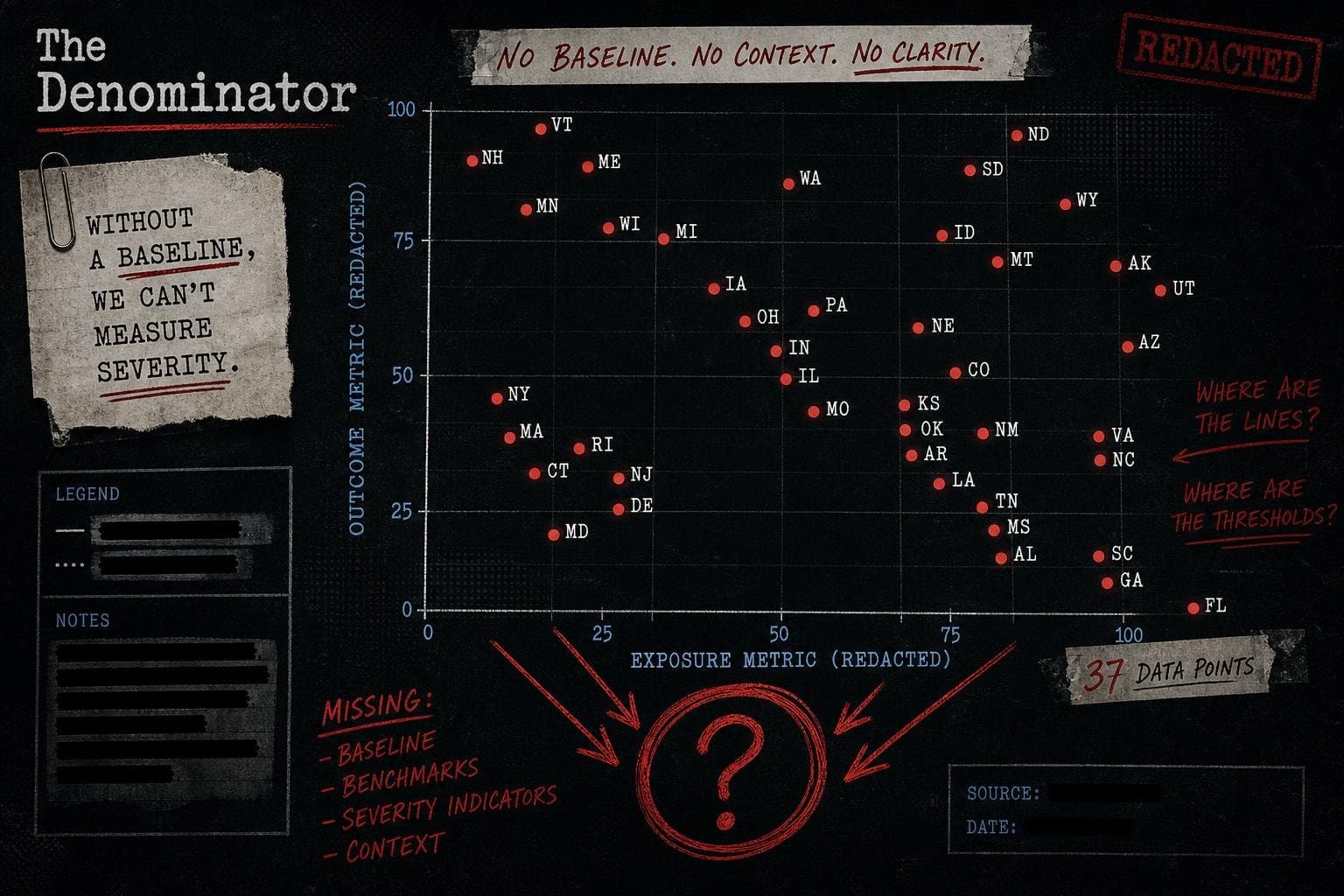

A single statistic landed quietly on the CDC's modeling dashboard this week: as of July 22, 2026, COVID-19 infections are estimated to be growing or likely growing in 37 states, declining or likely declining in 0 states, and holding steady in 11. Thirty-seven states. Zero declining. That's the kind of number that gets screenshot-cropped and posted without context, and it's already making the rounds.
The number is real. The CDC published it. The methodology is documented. And it is doing approximately half the work that most people reading it will assume it's doing.
This is a story about Rt — what it measures, what it doesn't, and why a single epidemic trend metric stripped of its denominator is one of the most reliably misread numbers in public health communication.
What Rt Actually Measures (And What It Deliberately Ignores)
The time-varying reproductive number, Rt, answers one narrow question: is the number of new infections currently going up, going down, or staying flat? Specifically, it estimates whether the average infected person is passing the virus to more than one other person (Rt > 1, growth) or fewer than one (Rt < 1, decline).
The CDC's own framing is admirably direct about this limitation: "Rt cannot tell us about the underlying burden of disease, just the trend in infections." The agency goes further, explicitly stating that epidemic trends "indicate direction only and do not reflect the burden of disease" and should be used "alongside other surveillance metrics (such as the percentage of ED visits)."
That caveat is doing enormous work. Direction and burden are not the same thing. A disease can be growing — Rt > 1 — while causing far fewer hospitalizations, deaths, or serious outcomes than a previous wave where it was declining. The math is straightforward: if baseline prevalence is very low, even rapid growth produces small absolute numbers. If immunity is high, growth in infections doesn't translate proportionally into growth in severe disease. Rt tells you the slope of the curve. It says nothing about where the curve starts.
The CDC's Rt estimates are derived from daily incident emergency department visits reported through the National Syndromic Surveillance Program — not from confirmed case counts, not from hospitalizations, not from deaths. ED visits are a reasonable proxy for infection trends, but they're a filtered signal: they capture people sick enough to seek emergency care, which is itself a function of severity, healthcare access, and healthcare-seeking behavior. The denominator here is not "all infections." It never is.
The 37-State Number Has No Baseline Attached to It
Here's the comparison problem. "37 states growing" is a count. To evaluate whether that count is alarming, reassuring, or somewhere in between, you need to know:
- What is the current absolute level of COVID-19 activity?
- How does this growth compare to the same period in prior years?
- What is the severity profile of current infections relative to prior waves?
The CDC's Rt dashboard, as currently structured, answers none of these questions directly. It shows trend direction. The agency does note that ED visit percentages are displayed in callout boxes on the map — a crucial supplement — but those figures don't travel with the headline number when it gets shared.
The WHO's Global Respiratory Virus Activity update for Week 29 (ending July 19, 2026) provides useful global context: "SARS-CoV-2 activity remained low globally," with elevated positivity (above 10%) reported in Central America and the Caribbean, Tropical South America, and isolated countries in Middle Africa and South-East Asia. The northern hemisphere temperate zone — which includes the continental United States — is not flagged as a region of elevated SARS-CoV-2 positivity in that report.
That's a meaningful data point. The WHO's global surveillance, covering the same week as the CDC's Rt estimates, characterizes global SARS-CoV-2 activity as low. The CDC's Rt data says infections are growing in 37 states. Both can be true simultaneously. A low baseline growing at Rt > 1 is still a low baseline. The trajectory is worth watching. The trajectory alone is not the story.
Summer Seasonality Is the Missing Context
COVID-19 has shown a consistent summer pattern in the United States since 2021: a wave that typically peaks in July or August, driven partly by indoor air conditioning behavior, partly by immune waning from prior winter infections, and partly by variant dynamics. This is not a new phenomenon.
The CDC's Rt dashboard does not contextualize current growth against prior summer waves. It shows current direction. A reader encountering "37 states growing" in late July without knowing that late July has reliably shown growth for the past several years is missing the comparison year — which is, as this publication has argued repeatedly, the single most important piece of missing context in trend reporting.
The BLS's handling of its own missing data problem offers an instructive parallel here. When a lapse in government appropriations from October 1 to November 12, 2025 halted Consumer Expenditure Survey data collection, the agency's response was to convene expert panels, document the gap explicitly, and assess intervention options against three criteria: accuracy, statistical integrity, and timeliness. The BLS published a detailed methodology paper. It flagged the missing October 2025 CPI supplemental tables directly in its archive, noting the lapse in appropriations as the reason.
That's what responsible statistical communication looks like: name the gap, explain what it means for interpretation, and give users the tools to adjust. The CDC's Rt dashboard is transparent about what Rt can and cannot tell you — the caveats are there, in plain language. The problem is that the caveats don't travel. The number does.
The Denominator That Doesn't Get Shared
There's a structural asymmetry in how epidemic statistics circulate. The headline number — 37 states, Rt > 1, growing — is short, concrete, and alarming. The denominator context — "but current absolute activity is low, this is a summer pattern, severity metrics are not flagged as elevated" — is long, qualified, and requires three additional data sources to assemble.
This asymmetry is not unique to COVID surveillance. It's the same problem that produces "cases up 300%" headlines during the early phase of any outbreak, when the base rate is small enough that a handful of new cases produces a large percentage increase. It's the same problem that produces "X is the leading cause of Y" claims that omit the absolute risk. The percentage, the trend, the directional arrow — these travel. The denominator stays home.
The CDC's own guidance on Rt is explicit: the metric "is an additional tool to help public health practitioners prepare and respond." Practitioners. People who have access to the full surveillance picture, who know to check ED visit percentages alongside Rt, who understand seasonal baselines. The number was designed for a context-rich environment. It gets consumed in a context-poor one.
The WHO's Week 29 respiratory update is worth reading alongside the CDC dashboard precisely because it provides the global severity framing that Rt alone omits. The WHO notes that severity assessments are part of its reporting framework — not just positivity trends. That's the right model: trend plus burden, direction plus denominator.
What a Responsible Reading of This Data Looks Like
To be clear: the CDC's Rt data is not wrong. The methodology is documented. The caveats are published. The agency is doing what it should do — releasing surveillance data with appropriate technical framing.
The problem is downstream. Here's what a complete reading of the available data actually supports:
What the data shows: As of July 22, 2026, the estimated Rt for COVID-19 is above 1 in 37 states, indicating that the number of new infections is currently growing in those states. This estimate is derived from emergency department visit data, not confirmed cases or hospitalizations.
What the data does not show: Whether current absolute infection levels are high, moderate, or low by historical standards. Whether the growth is producing proportional increases in severe disease. Whether this trajectory is unusual for late July.
What additional sources suggest: The WHO's global surveillance for the overlapping week characterizes SARS-CoV-2 activity as low globally, with no elevated positivity flagged for the northern hemisphere temperate zone.
What would change the picture: A sustained increase in ED visit percentages above historical summer baselines, or WHO severity assessments flagging elevated hospitalization or mortality signals, would warrant a different framing. Those signals are not present in the current data.
That's the full sentence. "37 states growing" is the subject and verb. Everything above is the predicate that most reporting drops.
The Rt Number Is a Speedometer, Not a Map
A speedometer tells you how fast you're going. It doesn't tell you where you are, how far you've traveled, or whether the road ahead is clear. Rt is a speedometer for epidemic growth. It's a genuinely useful instrument — the CDC is right to publish it, and public health practitioners are right to monitor it. But a speedometer reading of 65 mph means something very different on an empty highway than in a school zone.
The 37-state Rt figure is worth watching. Summer COVID waves in the U.S. have ranged from barely detectable to genuinely disruptive, and the direction of travel matters for hospital planning, for vulnerable populations, and for anyone making decisions about indoor gatherings. The CDC is right to track it and right to publish it.
What it doesn't justify is the headline that writes itself from the number alone. "COVID Growing in 37 States" is technically accurate and contextually incomplete in exactly the way that produces the most durable kind of misinformation: not fabricated, just poorly denominated.
The question to ask every time you see an Rt figure: compared to what baseline, measured how, with what severity signal attached? If the answer isn't in the same sentence as the number, the number isn't doing the work being asked of it.