The Headline Number
"98.2% of Drugs coming into the U.S. by Ocean or Sea have STOPPED!" — Donald Trump, Truth Social
The Audit
I covered this number three days ago, so I'll be brief on the mechanics: the 98.2% figure is a comparison of drug seizures in two specific months — July 2025 and November 2025 — not a measure of actual drug flow. If you missed that issue, the short version is that seizure data measures what gets caught, not what gets through. The denominator — drugs that entered undetected — is, by definition, unknown.
But this week produced a second viral data distortion that runs the same playbook, and the pairing is instructive. Same trick, different dataset.
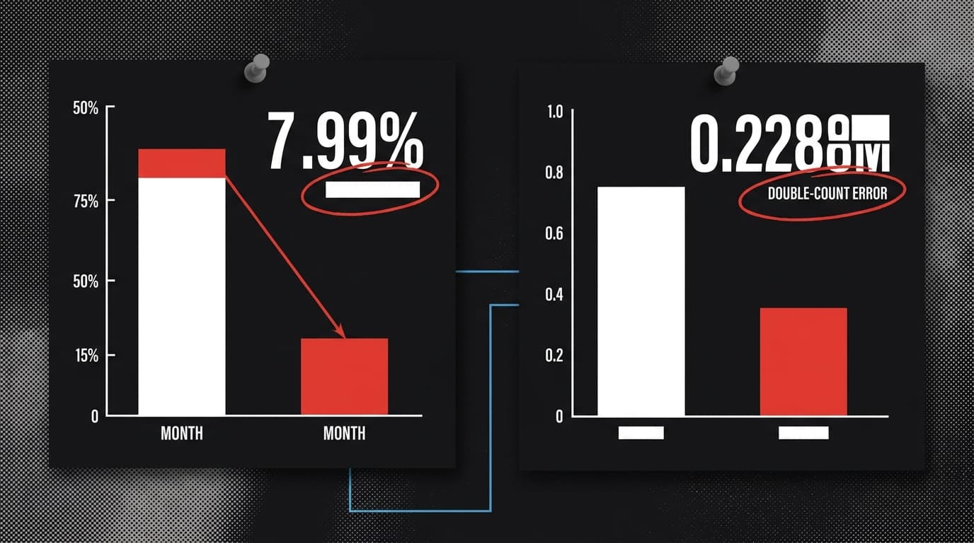
The chart that used real numbers to tell a false story
In early 2026, a chart circulated on X claiming that 8% of Nicaragua's entire population had entered the United States illegally during Biden's presidency. Similar percentages were displayed for Cuba, Haiti, Honduras, Venezuela, and Guatemala. The chart cited Customs and Border Protection data — a real government source.
Snopes traced the chart to its creator, who eventually deleted it after acknowledging an error. Two problems collapsed the claim:
First, the chart double-counted immigrants who temporarily entered the U.S. under a Biden-era humanitarian parole program — people who moved through the system legally and were counted multiple times as they interacted with CBP at different points.
Second, and more fundamentally: CBP "encounters" data counts encounters, not individuals. A single person who approaches the border, is turned back, and tries again generates multiple entries in the dataset. The chart treated each encounter as a unique person crossing into the country. That's not a rounding error. That's a category error.
The creator removed the chart. Other users kept sharing it.
The structure of the trick
Put the two cases side by side and the methodology is identical:
- Start with a real government dataset (CBP drug seizures; CBP border encounters).
- Select a slice that produces a dramatic number (two months; total encounters across four years).
- Present that slice as though it measures the thing people think it measures (drug flow; unique illegal crossings).
- Attach a conclusion the data cannot support.
Neither chart fabricated its source numbers. That's what makes this category of misinformation so durable. When someone says "but the data is from CBP," they're right. The problem isn't the data. It's the inference.
The Scientific Reports research published this month adds a useful wrinkle: corrections reduce credibility for high-trust sources more than for low-trust ones. Doctors who get corrected lose more credibility than politicians who get corrected. The implication for data journalism is uncomfortable — debunking a chart shared by a low-credibility source may do less damage to the original claim than you'd hope, because the audience already discounted the source's accuracy. The misinformation spreads; the correction lands on a different audience than the original claim reached.
What the data actually can and cannot tell you
CBP encounter data is genuinely useful for tracking where border activity is concentrated, which nationalities are presenting at which ports, and how enforcement resources are being deployed. It is not useful for answering "how many people entered the country illegally" — because encounters include legal presentations, people who were turned back, people counted multiple times, and people processed under humanitarian programs.
Drug seizure data is genuinely useful for tracking interdiction capacity and effort. It is not useful for answering "how much drug trafficking is happening" — because you cannot measure what you didn't catch.
Both datasets are doing real work. Both were asked to answer questions they structurally cannot answer. That's the move.
The forensic question to ask of any dramatic percentage: what is the denominator, and who constructed it? In the Nicaragua chart, the denominator was Nicaragua's population — a real number applied to a miscounted numerator. In the 98.2% claim, the denominator is implied to be "all drugs" — a number that doesn't exist in any dataset anywhere.
When the denominator is invisible, the percentage is decoration.
By the Numbers
98.2% — The share of maritime drug trafficking Trump claims has "stopped." AP News reports this is a two-month seizure comparison, not a measure of total drug flow; the actual volume of undetected trafficking is, by definition, unmeasurable.
8% — The claimed share of Nicaragua's population that entered the U.S. illegally under Biden, per a viral chart. Snopes found the figure double-counted parole program participants and conflated encounters with unique individuals; the chart's creator deleted it.
2 experiments — The scale of new peer-reviewed research on misinformation corrections. The study in Scientific Reports found that being intentionally inaccurate carries the steepest post-correction credibility penalty — which means framing matters as much as the correction itself.


