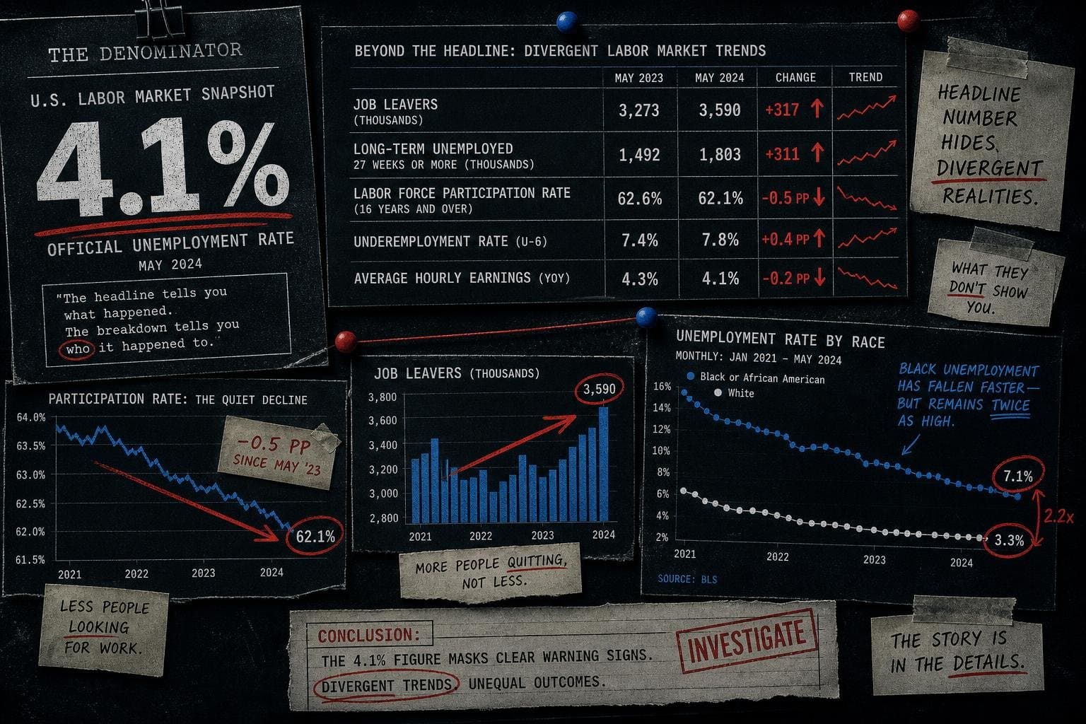

The headline from this morning's Bureau of Labor Statistics Employment Situation report is that the unemployment rate held at 4.1% in August 2026. Steady. Stable. Nothing to see here.
That's the number that will run in every wire story today. It is also, in isolation, close to useless.
The BLS household survey table sitting behind that headline contains at least four data points that tell a more complicated story — and none of them are getting the attention they deserve. Some of them point in opposite directions. That's not a contradiction; it's what a labor market in transition actually looks like. But you have to read the whole table to see it.
The Headline Rate Is Holding. The Composition of Unemployment Is Shifting.
Start with the number everyone will cite: 4.1% unemployment, unchanged from July. The civilian labor force grew by 683,000 people from July to August, and the number of employed people rose by 569,000. So the rate stayed flat because both the numerator (unemployed people) and the denominator (labor force) moved in roughly the same direction.
That's the math. Here's what's underneath it.
The number of job leavers — people who quit voluntarily and are now unemployed — jumped from 793,000 in July to 914,000 in August, a single-month increase of 121,000. That's a meaningful move. Job leavers are a signal of worker confidence: people quit when they think they can find something better. A surge in voluntary quits, even into unemployment, historically suggests workers believe the market will absorb them.
At the same time, the long-term unemployed — those out of work for 27 weeks or more — rose from 1,771,000 in July to 1,930,000 in August, an increase of 159,000 in a single month. Long-term unemployment is the hardest category to reverse. People who have been out of work for six months or more face compounding disadvantages: skills atrophy, networks thin, employer screening intensifies. The Census Bureau's economic indicators track the downstream effects of this kind of structural joblessness — in retail sales, housing starts, and consumer spending — and those effects tend to lag the unemployment data by several quarters.
So in the same August report: voluntary quits up sharply (confidence signal), long-term unemployment up sharply (distress signal). These aren't contradictory — they describe two different populations. But reporting only the headline rate papers over both.
The Teenager Number Is a Seasonal Artifact. The Black Unemployment Number Is Not.
Two demographic figures in the August table deserve separate treatment, because they're being driven by entirely different forces.
Teenage unemployment (ages 16–19) jumped from 12.1% in July to 14.1% in August — a two-percentage-point move in one month. This will alarm some readers. It shouldn't, particularly. August is when summer jobs end and students return to school. The BLS seasonally adjusts the overall unemployment rate, but demographic subgroup volatility around school-year transitions is well-documented. The July number (12.1%) was itself unusually low — the lowest in this table's visible window — which made the August rebound look more dramatic than it is. The base rate matters: teenage unemployment runs structurally higher than adult unemployment in every month of every year, and August-to-September swings are among the noisiest in the series. This is a number to watch across a full year, not month-to-month.
Black unemployment is a different story. It fell from 6.3% in July to 6.0% in August — and the trend over the past year is worth noting. In August 2025, Black unemployment stood at 7.6%. Twelve months later, it's at 6.0%. That's a 1.6-percentage-point decline over twelve months, against a backdrop where overall unemployment moved from 4.3% to 4.1% over the same period — a much smaller shift.
I want to be careful here. This is observational data from a household survey. It does not tell us why Black unemployment fell faster than the overall rate over this period. It does not establish a cause. What it does establish is a pattern worth tracking: the gap between Black unemployment and overall unemployment has narrowed over this twelve-month window, from 3.3 percentage points (7.6% vs. 4.3%) to 1.9 percentage points (6.0% vs. 4.1%). That's a real change in a real gap. Anyone citing the overall unemployment rate as a summary of labor market health is leaving this out.
The Participation Rate Tells a Story the Unemployment Rate Cannot
Here is the number that the unemployment rate structurally cannot capture: the labor force participation rate.
In August 2025, 62.3% of the civilian noninstitutional population was in the labor force. In August 2026, that figure is 61.6%. That's a 0.7-percentage-point decline over twelve months, against a civilian noninstitutional population that grew by roughly 1.4 million people over the same period.
The unemployment rate only counts people who are actively looking for work. Someone who has stopped looking — discouraged, retired early, caring for a family member, unable to find childcare — disappears from the unemployment rate's numerator and denominator simultaneously. They don't make the rate look better or worse. They just vanish from the calculation. This structural blind spot in the headline rate is not new; it's the same denominator problem that recurs across public data reporting, from marijuana product safety complaints that took over seven months on average to reach public warning to disease surveillance counts where the denominator of tested or exposed populations goes unreported. In each case, the number that circulates is real — it's the missing context that does the damage.
The "not in labor force" category grew from 103,251,000 in August 2025 to 105,638,000 in August 2026 — an increase of roughly 2.4 million people over twelve months. Some of that is demographic (an aging population produces more retirees). Some of it may be something else. The data doesn't tell us which. But the participation rate decline is real, it spans twelve months, and it means the 4.1% unemployment rate is measuring a slightly smaller share of the working-age population than it was a year ago.
This is not a new critique of the unemployment rate — economists have made it for decades. But it keeps mattering because the headline rate keeps getting reported as if it's a complete picture. It isn't. It's a ratio. The denominator is doing work that the headline never acknowledges.
Part-Time for Economic Reasons: The One Number That Actually Improved
Credit where it's due: one of the underreported figures in this report is genuinely good news, and it's worth saying so clearly.
People working part-time for economic reasons — meaning they want full-time work but can only find part-time, or their hours were cut due to slack business conditions — fell from 4,804,000 in July to 4,390,000 in August, a drop of 414,000 in a single month. The subcategory of people who "could only find part-time work" fell from 1,428,000 to 1,263,000. The subcategory of people on reduced hours due to "slack work or business conditions" fell from 3,019,000 to 2,815,000.
This matters because involuntary part-time employment is one of the better proxies for underemployment — the gap between the work people have and the work they want. The direction of movement in August is unambiguous: fewer people are stuck in part-time work against their will. That's a real improvement, and it's the kind of improvement that doesn't show up in the headline unemployment rate at all.
The 2026 Census Test, which wrapped its field operations in Huntsville, Alabama and Spartanburg, South Carolina on August 31, offers a useful parallel here. The Census Bureau is stress-testing its counting methodology precisely because headline counts — like headline unemployment rates — can obscure who gets missed. The operational question in both cases is the same: what does the denominator actually include, and who falls outside it?
A well-constructed dataset rewards the reader who checks the internals. This is one of those moments.
What the August Report Actually Tells You
The August 2026 employment situation, read carefully, describes a labor market with at least three simultaneous dynamics:
Confidence is present. The surge in voluntary job leavers suggests workers are willing to quit into unemployment — which historically happens when people believe they'll find something better. The drop in involuntary part-time employment reinforces this: fewer people are stuck in jobs that don't meet their needs.
Long-term unemployment is accumulating. The 159,000-person single-month jump in the 27-weeks-and-over category is the kind of number that deserves a follow-up question: who are these people, and what sectors are they coming from? The household survey doesn't answer that. The payroll survey and JOLTS data do, partially. But the trend is worth watching across the next two or three months to see whether this is noise or signal.
The participation rate is the context that the headline erases. A 4.1% unemployment rate measured against a 61.6% participation rate is a different statement about labor market health than a 4.1% rate measured against a 62.3% participation rate. Both numbers are real. Only one of them runs in the headline.
The August jobs number is not alarming. It's also not the simple good-news story the headline rate implies. The table is doing at least four things at once, and the only way to see them is to read past the first row.
That's always been the job. The BLS publishes the full table every month. Most coverage stops at the summary. The gap between those two things is where the actual information lives.