


The Headline Number
"98.2% of drugs smuggled in via ocean routes have been stopped." — President Trump, Truth Social, April 2026
The Audit: You Can't Measure What You Don't Catch
The White House, asked by AP News for the source, pointed to Customs and Border Protection seizure data. That's a real dataset. The number almost certainly comes from it. And that's exactly the problem.
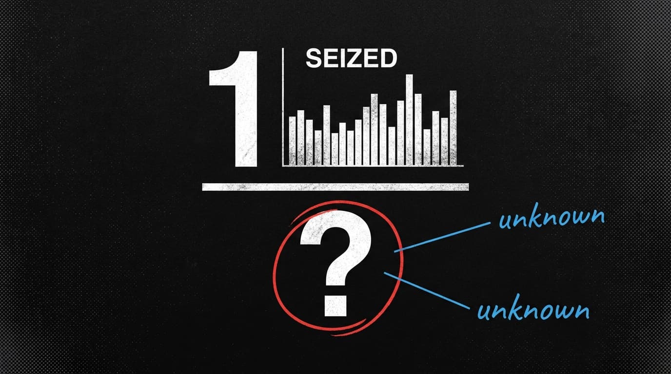
Here's the trick: a seizure rate is not a success rate.
To calculate "98.2% stopped," you need two numbers — drugs intercepted and drugs that got through. CBP can tell you the first. Nobody on earth can tell you the second. Experts told AP that the actual total flow is unknowable because, by definition, undetected smuggling leaves no record.
What CBP data actually shows is how much was seized. Presenting that as a percentage of total trafficking requires an estimate of total supply — and no such estimate is cited, because none is being used. The 98.2% figure is seizures divided by... seizures. It's a fraction with itself in the denominator.
This is one of the cleanest examples of a missing denominator you'll see in the wild. The number sounds precise to one decimal place. That precision is doing a lot of work to disguise the fact that the denominator is invented, or absent entirely.
The verdict: misleading. Not because the underlying CBP data is fabricated — it isn't — but because the claim built on top of it requires information that doesn't exist. A single wrong denominator destroys the entire calculation.
This pattern — real data, fraudulent framing — is exactly what a Snopes analysis of a viral immigration chart documented the same week. That chart used genuine CBP encounter figures to claim 8% of Nicaragua's population entered the U.S. illegally under Biden. The flaws: it double-counted people enrolled in a temporary legal program, and CBP "encounters" include people who were turned back at the border and never entered. The chart's own creator deleted it after identifying the error. Others kept sharing it.
Two charts. Same agency's data. Same structural problem: the official number is real; the story built around it isn't.
The deeper issue, as a University of Waterloo statistician argued in The Conversation, is that most people — including many who produce these charts — don't distinguish between a measurement and an inference. CBP encounter counts are measurements. "Percentage of total illegal entries" is an inference. Conflating the two isn't always malicious. Sometimes it's just innumeracy dressed up in official-looking data.
But intent doesn't change the math. A percentage without a valid denominator is not a statistic. It's a talking point wearing a statistic's clothes.
Watch for: Whether CBP releases updated maritime interdiction methodology in the next budget cycle. If the administration wants to defend 98.2%, they'll need to publish their total-flow estimate — and that estimate will be auditable.
By the Numbers
8% — Share of Nicaragua's population that a viral chart claimed entered the U.S. illegally under Biden. The actual CBP data it drew from counts encounters, not entries, and double-counted participants in a legal temporary program. The chart's creator deleted it. Snopes
"No evidence" — The finding of a 2020 American Statistical Association report on mail-in voting and fraud risk, per NYT reporting. The reframe: absence of evidence in a well-studied question is itself evidence. This isn't an open question with two sides.
Equivalently — How corrections reduced belief in misinformation across both high-credibility sources (doctors) and low-credibility sources (politicians) in a new Scientific Reports experiment. The asymmetry: corrections hurt doctors' credibility more than politicians'. Accuracy costs more reputationally when people already expect you to be right.