


The Headline Number
"98.2% of Drugs coming into the U.S. by Ocean or Sea have STOPPED!" — Donald Trump, Truth Social
I wrote about this number two issues ago. The short version: it's a comparison of two cherry-picked months — July 2025 versus November 2025 — not a trend, not a total, and not a measure of drugs actually stopped. Seizure data can't tell you what wasn't seized. The denominator is, by definition, unknown.
That verdict stands. But this week a second number arrived that deserves the same treatment.
The Pattern Is the Story
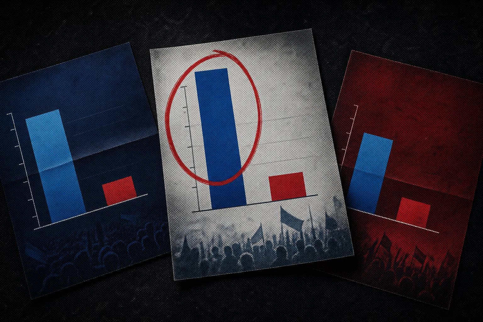
Full Fact's investigation into UK local election leaflets — published this month ahead of May elections — found that in a sample of 50+ leaflets containing charts or graphics, at least 14 failed to provide reliable evidence for their central voting claims. The problems: national polling used to assert local outcomes, bars drawn out of proportion to the numbers they represent, and claims like "only we can win here" with no ward-level data to support them.
This is the 98.2% trick in a different suit. The mechanism is identical: take a real number, strip the context that would make it meaningful, and let the reader's brain fill in the rest. Trump's number came from CBP's own data — AP confirmed the White House cited it directly. The leaflet bar charts presumably came from real polls somewhere. The fabrication isn't in the source. It's in the framing.
Peter Kellner, former YouGov chairman, told Full Fact what good practice looks like: cite the date, the geographic coverage, and the nature of the data. If it doesn't relate specifically to the ward being contested, say so. That's not a high bar. It's just a denominator.
The 98.2% post argued that most misinformation isn't fabricated — it's decontextualized math. The election leaflet data makes the same point from a different angle. This isn't a Trump problem or a UK political party problem. It's a structural one: the incentive to claim certainty is always stronger than the incentive to explain methodology. A bar chart that says "we're winning" moves votes. A bar chart that says "we're winning in national polling, which may not reflect this specific ward" does not.
The fix isn't complicated. It's the same fix every time: show the denominator, name the comparison period, specify the geography. Three pieces of information. Consistently absent. Consistently consequential.
By the Numbers
70% of respondents in a 16,000-person, 16-country survey believe at least one false or unproven health claim — but the survey hasn't been peer reviewed and was published by the Edelman Trust Institute, whose chief executive called the results "staggering." Worth watching for independent replication before treating that figure as settled.
87% response rate in Pew's March 2026 American Trends Panel on U.S. foreign policy attitudes — unusually high for a survey, because ATP panelists are pre-recruited and incentivized. The cumulative response rate accounting for initial recruitment attrition is 3%. Both numbers are real; only one usually gets cited.
14 of 50+ election leaflets flagged by Full Fact contained misleading or unsourced claims — but that's a floor, not a ceiling. Their analysis covered only leaflets uploaded to one public archive in the first two weeks of April.