


The Headline Number
"95% of generative AI pilots at companies are failing."
— Circulated widely in August 2025, attributed to an MIT study, repeated by Forbes, Axios, The Hill, and Harvard Business Review, and significant enough to contribute to a Nasdaq selloff.
The Audit
I've written before about the 98.2% drug trafficking claim — a number that misrepresented what CBP data actually measures. That was a case of a real statistic applied to the wrong question. The AI failure rate story is something slightly different and, in some ways, worse: the headline number wasn't even a correct description of the study it supposedly came from.
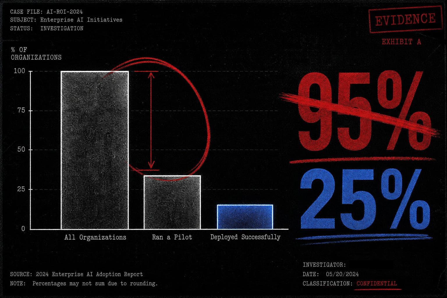
Start with the actual survey findings, as reconstructed from the original report:
- 60% of surveyed organizations had investigated custom enterprise AI tools.
- 20% had actually run a pilot project.
- 5% of the total sample had successfully deployed those tools in production.
That's the raw data. Now watch what happens when you skip the denominator.
Journalists — and, apparently, the report itself — described this as a "95% failure rate for enterprise AI." But 80% of the organizations in the sample never ran a pilot at all. Calling them failures is like counting everyone who didn't apply to medical school as a failed doctor. The 95% figure treated non-participation as failure, which is not a methodology choice — it's a category error.
The correct calculation, if you want to measure pilot success, is to look only at organizations that actually ran pilots. That's the 20% who got that far. Of those, roughly a quarter successfully deployed. A 25% pilot-to-production rate. Not a ringing endorsement of enterprise AI readiness, but also not the apocalyptic figure that moved markets.
Here's the comparison that reframes everything: a 25% success rate for internal technology pilots is, by most corporate project management standards, not embarrassing. The report's own bar for "success" required demonstrating a "marked" business impact — a high threshold for any new technology deployment, let alone one as nascent as generative AI in 2024. The headline implied mass failure. The underlying data showed a moderately successful early adoption curve among the organizations willing to try.
The math was wrong in two compounding directions. First, the denominator included non-participants. Second, even the report itself misread its own graph, describing a 95% failure rate when its data showed a 25% success rate among pilots. The press then faithfully reproduced the report's own error, which is how you get Harvard Business Review running with a number that doesn't survive thirty seconds of arithmetic.
This is the mechanism worth understanding. The study wasn't fabricated — the survey data existed. The failure was interpretive, and it cascaded: the report misread its own findings, journalists trusted the report's framing rather than the underlying table, and editors published a number that was, by any reasonable construction, five times worse than what the data showed.
The "compared to what?" question would have caught this immediately. 95% of what, exactly? All companies? All pilots? All deployments? The answer to that question changes the number from 95% to 25% — a factor of nearly four, in the same direction as the petrol chart error I flagged two weeks ago. Suspiciously round, suspiciously dramatic numbers are often a signal that someone skipped this step.
Verdict: Misleading. The underlying survey data is real. The 95% figure is not a defensible reading of it, by the report's own numbers.
By the Numbers
28% — The reduction in belief in false information when warning labels were applied, in a study of over 14,000 U.S. participants. The reframe: even among participants who reported low trust in fact-checkers, labels still reduced misinformation sharing by more than 16% — suggesting the mechanism isn't credibility transfer, it's friction.
"Nearly half" — The share of U.S. adults that a Politico poll was reported to show "doubt vaccine safety." The reframe: the actual survey question conflated skepticism about mandates with skepticism about vaccine science, making it impossible to distinguish the two — and the headline treated the ambiguity as settled fact.
8% — The share of Nicaragua's population that a viral chart claimed entered the U.S. illegally under Biden. The reframe: the chart used CBP "encounters" data, which counts interactions with border authorities — not individuals, not successful entries — and double-counted people who used a legal temporary program, inflating the totals before the chart's own creator deleted it.