A number becomes a fact through repetition, not verification. The claim that "half of Americans can't afford a $400 emergency" has appeared in congressional testimony, presidential speeches, and roughly ten thousand LinkedIn posts about the fragility of the American middle class. It is sourced to a real Federal Reserve survey. It misstates what that survey found. And the gap between the headline and the data isn't a rounding error — it's a methodological collapse that has been quietly correcting itself in the underlying numbers for years while the headline stayed frozen.
This is a story about a statistic that outlived its accuracy, a framing choice that got laundered into fact, and what the actual data says about household financial resilience in 2026.
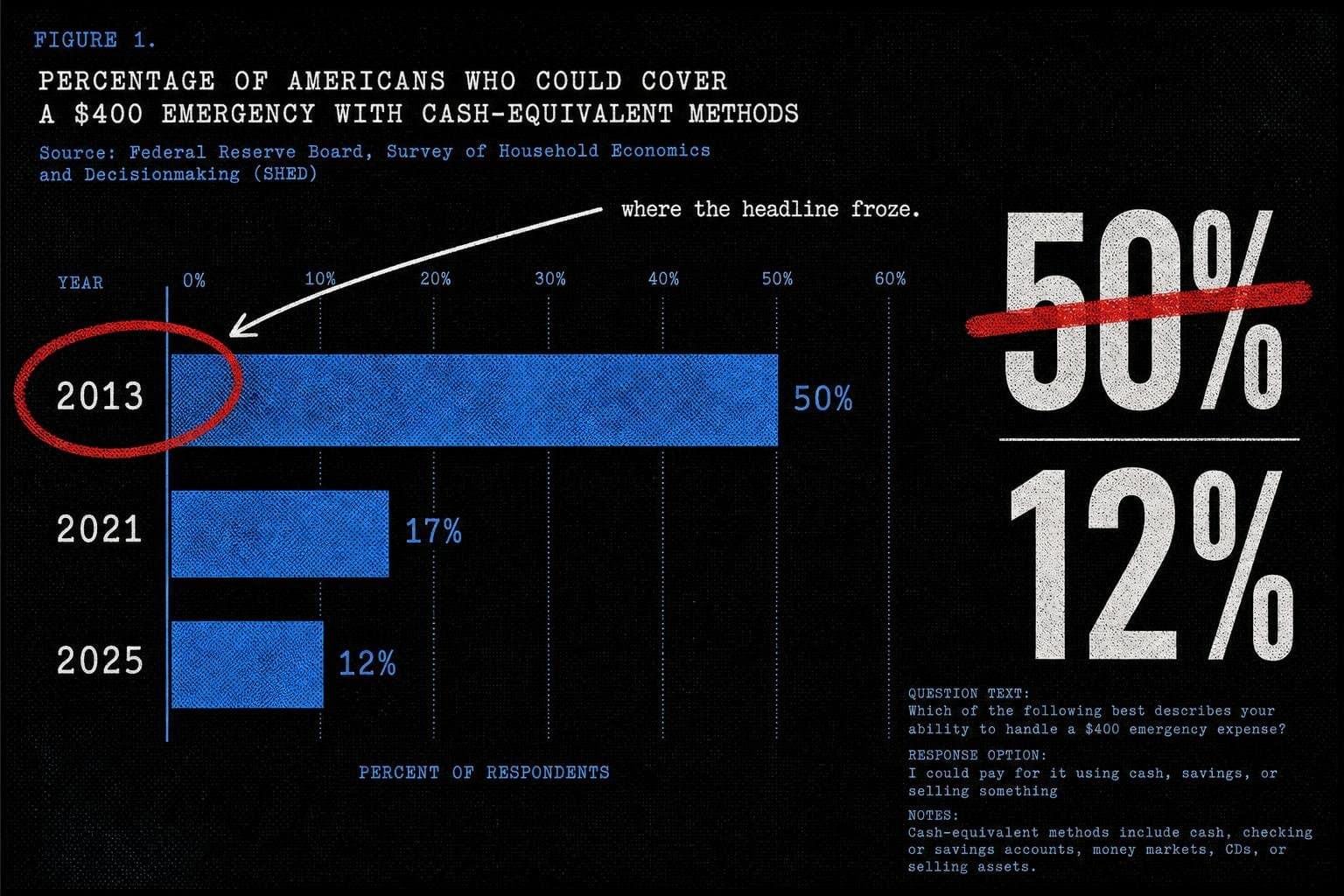
The Number That Wouldn't Die
Start with what the Federal Reserve's 2025 Survey of Household Economics and Decisionmaking (SHED) actually asked. The question was not: "Could you afford a $400 emergency?" It was: "How would you pay for a $400 unexpected expense?" Respondents could choose cash or savings, a credit card paid off at the next statement, a credit card carried as a balance, borrowing from family or friends, selling something, or "I couldn't pay for this right now."
The 2025 SHED, released in May 2026, found that 63% of U.S. adults said they would cover the expense entirely with cash, savings, or a credit card paid off immediately — what the Fed calls "cash-equivalent" methods. That leaves 37% who would use some other method. And 12% said they could not pay the expense at all, by any means.
So the accurate version of the claim, drawn from the same survey that spawned the headline, is this: about one in eight U.S. adults cannot currently cover a $400 emergency by any method. That is a real and serious problem. It is not "half of Americans."
The gap between 12% and 50% is not a rounding error. It is a factor of four. And it matters enormously for how we understand the policy problem — because "half the country is one car repair from disaster" implies a very different intervention than "one in eight adults has no financial cushion at all."
How the Framing Got Laundered
The origin story is traceable. The Fed began asking the $400 question in 2013. That first year, 50% of adults said they would pay with cash or its equivalent — meaning 50% would not. The inverse of that finding got paraphrased into circulation. A widely-read 2016 Atlantic essay on financial precarity amplified the frame, and from there it entered the permanent vocabulary of economic anxiety discourse.
The problem is that the framing collapsed three distinct categories into one. The Fed's "not cash-equivalent" bucket included people who would carry a credit card balance (a financial inconvenience), people who would borrow from family (a social resource, not an inability to pay), people who would sell something (a liquidity choice), and people who genuinely could not pay at all. Treating all four groups as equivalent to "can't afford it" is a denominator error wearing a policy argument.
This is the trick this publication has documented before in other contexts: the headline grabs the largest available number, strips the methodology, and presents it as a simple capability claim. The 2013 version of the stat was at least defensible as a description of payment behavior — though even then, "would carry a balance" and "cannot pay" are not the same thing. But the headline calcified while the underlying data kept moving.
The same dynamic surfaced in the May jobs numbers, where headline figures and their underlying methodological caveats routinely diverge in public coverage. A number exits a government report, sheds its confidence intervals and sample construction in the first retweet, and arrives in a policy speech as settled fact. The $400 stat is that process running for a decade without correction.
The Trend the Headline Ignored
Here's what makes this particularly frustrating from a data hygiene standpoint: the number improved substantially, and almost nobody updated the claim.
The 2025 SHED data shows the cash-equivalent rate peaked at 68% in 2021 — meaning the share of adults who would struggle with a $400 expense hit its lowest point in the survey's history during the pandemic stimulus period. It has since settled back to 63%, where it has been roughly flat since 2022.
| Survey Year | Would Cover $400 with Cash or Equivalent |
|---|---|
| 2013 | ~50% |
| 2021 | 68% (peak) |
| 2022–2025 | ~63% (stable) |
Source: Federal Reserve SHED historical unexpected-expenses table
The trend direction over the survey's full history is unambiguously positive — from 50% in 2013 to 63% in 2025. That's a 13 percentage-point improvement over roughly twelve years. The claim that "half of Americans can't afford $400" was most accurate in 2013. By 2025, the cash-equivalent share had risen by more than a quarter relative to its starting point.
None of this means financial precarity has been solved. The 12% who say they cannot pay by any means represents tens of millions of adults. The 37% who would use non-cash-equivalent methods includes real financial stress — carrying credit card debt at 20%+ interest is not a neutral outcome. But the story the data tells is one of gradual, uneven improvement, not a static crisis frozen at the 2013 level. The headline didn't update. The data did.
Why "Compared to What?" Destroys the Claim
Apply the standard stress test: compared to what?
The "$400 emergency" framing implies that $400 is a meaningful threshold — a number that separates the financially secure from the financially precarious. But the survey doesn't tell us whether $400 is the right threshold, whether it has kept pace with inflation since 2013, or how the distribution of responses varies by income, age, or geography. A 35-year-old earning $85,000 who would put a $400 car repair on a credit card and pay it off next month is not in the same situation as a 60-year-old on fixed income who genuinely cannot pay. The survey lumps them together.
The Fed's methodology — asking about a single hypothetical expense — also can't distinguish between people who lack liquid assets and people who prefer to use credit for cash-flow management reasons. These are different behavioral profiles with different policy implications. The survey is measuring payment method preference under a hypothetical, not actual financial capacity.
This is not a criticism of the Fed survey, which is a carefully constructed instrument that has tracked a consistent question over time. It's a criticism of what happens when a nuanced behavioral measure gets stripped of its methodology and turned into a capability claim. The survey asks "how would you pay?" The headline answers "can you pay?" Those are different questions.
The BLS faces the same interpretive pressure on its own outputs. Brett Matsumoto, Trump's nominee to head the Bureau of Labor Statistics, acknowledged at his June 10 confirmation hearing that technical issues — including low survey response rates — have undercut data quality in recent years. That's a candid admission that the instruments producing our most-cited economic numbers have known limitations. The $400 stat illustrates what happens when those limitations get edited out in translation.
The Broader Pattern: Frozen Statistics in a Moving World
The $400 stat is a case study in what might be called statistical fossilization — a number that was approximately accurate at one moment, got embedded in public discourse, and then persisted long after the underlying data moved. The same dynamic appears in other widely-cited economic claims: figures that were true in a specific year, under specific methodological conditions, that get repeated as timeless facts.
The mechanism is straightforward. A striking number gets published. Journalists and advocates cite it because it's sourced to a credible institution. The citation chain shortens with each retelling — "the Fed found" becomes "studies show" becomes "everyone knows." The original methodology disappears. And because the claim is directionally true (financial precarity is real), nobody feels the urgency to check whether the specific number still holds.
This is distinct from fabrication. The $400 stat isn't invented. The Fed survey is real, the 2013 data is real, and the underlying problem — that a significant minority of Americans have no financial cushion — is real. The error is contextual: wrong year, wrong framing, wrong denominator. Most statistical misinformation isn't fabricated. It's just poorly contextualized math that nobody bothered to update.
Consider how the same failure mode appeared in a viral chart comparing European heat deaths to American gun deaths. Hannah Ritchie's analysis found that the chart used modeled "excess death" figures for European heat mortality but death-certificate figures for the U.S. — two methodologically incompatible denominators presented as a direct comparison. The underlying concern (Europe's heat vulnerability is real, America's gun death rate is real) was legitimate. The specific numbers, as presented, were not comparable. Directionally true, methodologically broken. The $400 stat runs the same play.
The FiveThirtyEight archive — which spent years doing exactly this kind of methodological excavation — is no longer accessible, having been scrubbed from the internet after Disney shut down the site in 2025. As FlowingData noted, in its heyday FiveThirtyEight showed normal people how data analysis could be applied to everyday thinking — and that institutional memory is now gone. The work of checking whether the number still holds falls to fewer and fewer places. Statistical fossilization accelerates when the institutions doing the defrosting disappear.
What the Actual Data Supports
To be precise about what the 2025 SHED does and does not tell us:
Supported by the data: About 37% of U.S. adults would not cover a $400 unexpected expense entirely with cash-equivalent resources. About 12% say they could not pay by any means. Both figures represent real financial vulnerability for tens of millions of people.
Not supported by the data: That "half of Americans can't afford $400." The 50% figure is from 2013. The 2025 figure for inability to cover with cash-equivalent methods is 37%, and the figure for genuine inability to pay is 12%.
Not answerable by this data: Whether $400 is the right threshold, whether the non-cash-equivalent group is in genuine distress or making a cash-flow preference, or how these figures vary by demographic subgroup (the SHED does break these out, but the headline claim doesn't).
The policy implication of 12% is different from the policy implication of 50%. If one in eight adults cannot cover a $400 emergency by any means, that suggests targeted interventions for the most financially vulnerable. If half of adults cannot, that suggests a systemic crisis requiring broad structural response. These are not the same diagnosis, and they don't call for the same treatment.
The $400 stat will probably survive this piece. It's too useful as shorthand, too embedded in the discourse, too emotionally resonant to dislodge with a table from the Fed's SHED appendix. But the next time you see it cited in a policy argument, ask the question the headline never does: which year's data? Which respondents? And what exactly did "can't afford" mean in the survey that produced it?
The Fed publishes the SHED annually. The 2025 results are available. The number is 12%, not 50%. Someone should probably update the talking points.


