


The Headline Number
"New applications for U.S. unemployment benefits fell more than expected last week, suggesting labor market conditions remained stable." — Reuters, April 16, 2026
The Audit
"Stable" is one of those words that sounds like a finding but is actually a framing choice. And right now, it's being applied to a labor market that deserves a closer look at the denominator.
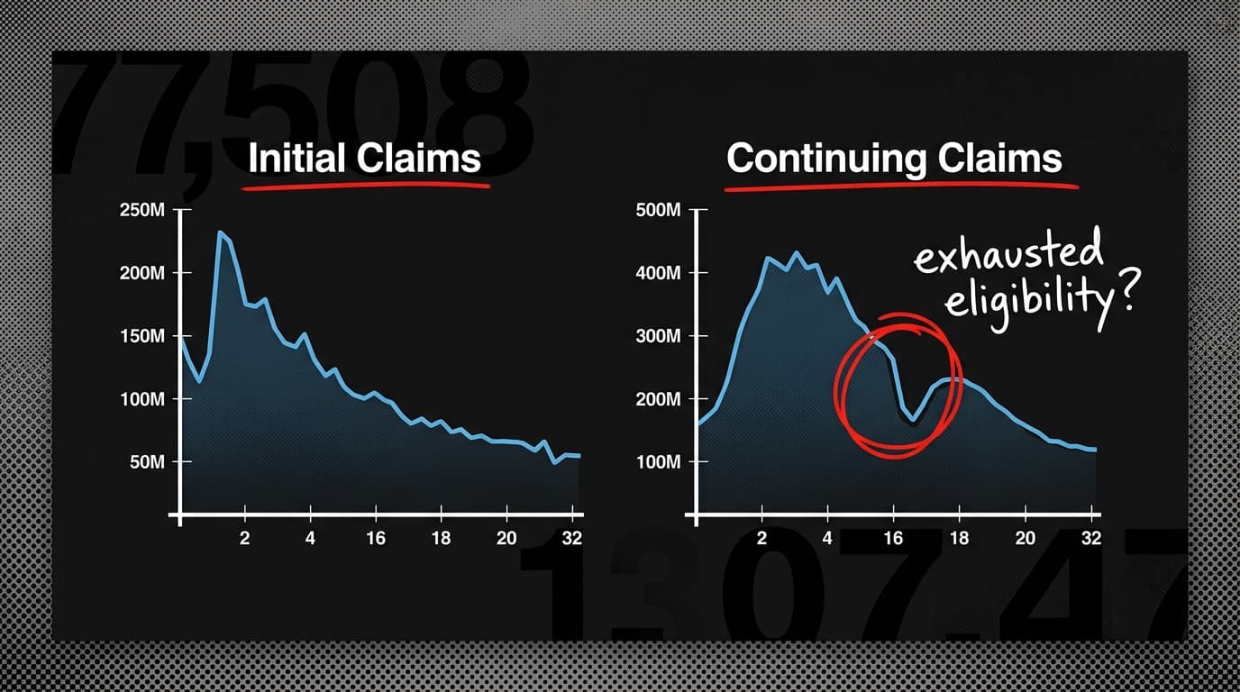
Initial jobless claims — the weekly count of people filing for unemployment for the first time — have indeed stayed low. That's real. But initial claims measure one thing: new job losses. They don't measure whether people who lost jobs months ago are finding new ones. That's a different number, and it's telling a different story.
Reuters flagged it directly in the April 9 report: part of the decline in so-called continuing claims — the count of people still collecting benefits week after week — was likely because workers were exhausting their 26-week eligibility window. Not because they found jobs. Because the clock ran out.
That's the missing denominator. When continuing claims fall, the instinct is to read it as good news: fewer people unemployed. But if the drop is driven by benefit exhaustion rather than reemployment, the headline number is measuring administrative cutoffs, not labor market health. The unemployed don't disappear when their checks stop. They just stop showing up in the count.
This matters more than usual right now. Reuters noted in the same report that employers are cautious about increasing headcount amid broader economic uncertainty. Caution about hiring plus workers aging out of benefits is a combination that can make the labor market look stable in the data while feeling increasingly precarious to the people in it.
The verdict: misleading by omission. The initial claims number is probably fine. The "stable" conclusion drawn from it skips over the mechanism driving the continuing claims decline — and that mechanism matters enormously for anyone trying to understand whether the labor market is actually absorbing displaced workers or just losing count of them.
The most dangerous statistical move isn't fabricating a number. It's picking the right number for the wrong question.
By the Numbers
40% — Average Australian petrol price increase between March 1–29, per the Australian Institute of Petroleum. A viral graphic claimed the US rose only 16.6% in the same period; actual US data showed 35.1% by April 6. The "four times higher" gap was closer to one-tenth of that.
26 weeks — Maximum unemployment benefit eligibility in most U.S. states. After that, exhausted claimants exit the continuing claims count regardless of employment status — a structural floor that makes the number unreliable as a recovery signal during prolonged downturns.
9–11 percentage points — The actual gap between Australian and US/Canadian petrol price increases in March, per AAP's fact-check. The viral graphic implied a gap four times larger. One wrong baseline, multiplied across eleven countries, and suddenly the chart is evidence of something that didn't happen.