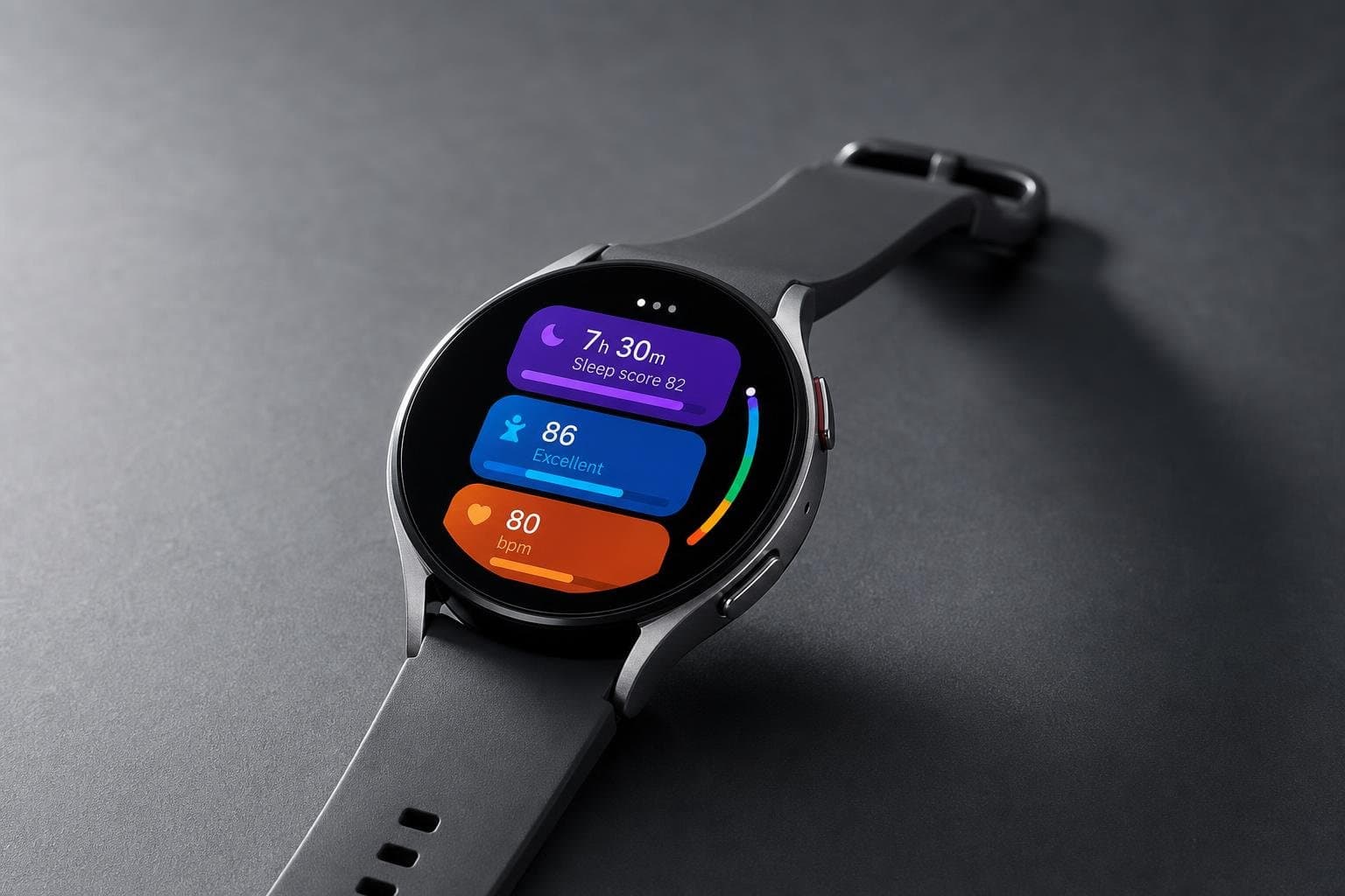

Something happened this week that didn't get nearly enough attention: Samsung quietly pushed a major redesign of its Samsung Health app — the nerve center for every Galaxy Watch and fitness tracker the company sells — ahead of the Galaxy Watch 9 launch. Android Authority's Andy Walker spent several hours with the new version and came away with a reaction that's worth sitting with: initial disgust, followed by something more complicated.
That "more complicated" feeling is, I'd argue, the defining consumer tech emotion of mid-2026.
The Color Problem Is Actually a Data Problem
Walker's first complaint about the redesign is that it looks like, in his words, "a Crayola box puked on my phone." But the real issue isn't aesthetic — it's functional. The old Samsung Health app used color with intention: green for activity, blue for sleep. The new version assigns purples to calories and sleep scores, blues to workouts and body composition, orange to stress and food — with no consistent logic connecting color to meaning.
For a health app, this matters more than it would in, say, a music player. When you wake up and glance at your overnight data, you're making fast pattern-recognition decisions. Color is supposed to help you do that faster. When the colors are decorative rather than informational, the app is actively working against you.
This is a specific, concrete failure — and it's one that reveals a broader temptation in the industry right now. Companies are under enormous pressure to show that their software has been "reimagined" for the AI era. The result is often a redesign that looks dramatically different without working meaningfully better. Samsung Health's new UI is a case study in that trap.
Where the Redesign Actually Works
To Walker's credit — and Samsung's — the new version isn't all regression. The top shortcut bar that lets you jump between Activity, Sleep, Vitals, Mindfulness, and Nutrition is a genuine improvement. Navigation that used to require digging is now one tap away. That's the kind of change that makes a real difference in daily use, and it's the kind of thing that tends to get buried under the flashier visual overhaul.
The pattern here is familiar: the structural improvements are real, the surface-level changes are overdone, and the net result is an app that's better in some ways and worse in others. Whether that's a net positive depends entirely on how you use it.
The Bigger Picture: AI Features Are Multiplying Faster Than They're Maturing
Samsung Health's redesign is arriving alongside a broader wave of AI-forward software updates. Apple's WWDC26 announcements included a "next generation" of Apple Intelligence and an entirely new version of Siri — now called Siri AI — built on what Apple describes as a "bold new architecture uniquely designed to protect users' privacy." The iPhone 17 Pro ships with iOS 26 and positions Apple Intelligence as central to the experience, from Live Translation during phone calls to on-screen context awareness.
Meanwhile, Stuff's roundup of the best AI phones for 2026 puts the Google Pixel 10 at the top for AI integration — specifically because of tight Gemini embedding and first-in-line software updates — while noting that Apple's iPhone 17 Pro Max "ticks all the AI boxes, but in a typically Apple way," meaning features are woven into existing apps rather than announced as a separate layer. Samsung's Galaxy S26 Ultra earns praise for a "world-first privacy display" and strong image processing, but the review is careful to note its camera hardware isn't the outright best — the processing is what carries it.
What's striking across all three platforms is how differently they're answering the same question: where does AI live on your phone? Google puts it in the assistant and the camera. Apple embeds it invisibly into apps. Samsung makes it visible — sometimes too visible, as the Health redesign demonstrates.
PCMag's best Android phones list flags a telling detail about the Pixel 10 Pro: "advanced, easy-to-use AI features" is a selling point, but so is "battery life should be longer." The AI era hasn't solved the basics yet.
What to Actually Do With This
If you own a Galaxy Watch or use Samsung Health regularly, the update is already on your phone. Give it a week before judging it — Walker's initial reaction softened with use, and the navigation improvements are real. But if the color chaos drives you to distraction, you're not wrong; that's a legitimate usability complaint, not a preference.
If you're shopping for a new phone and AI features are on your checklist, the honest answer from this week's coverage is that all three major platforms have something real to offer — and all three have something that still feels unfinished. The Pixel 10 series is seeing significant Prime Day discounts right now, which makes this a reasonable moment to buy if you've been on the fence.
The Galaxy Watch 9 launch — the event Samsung built this Health redesign around — is the next thing worth watching. If the watch hardware is strong and the app grows into its new design, Samsung's ecosystem case gets considerably more compelling. If the app stays this visually incoherent, the watch will be selling against its own software.